Promise
A new Canadian Tire store opened at Danforth Avenue & Main Street a few years ago, replacing an existing store that had been at the same location since the mid-70s. City staff reported in 2000 that the new store, about 15% larger than the old and consolidating several properties, would require some zoning variances but that it would be “compatible” with the existing retail strip on Danforth. According to the staff report, Canadian Tire’s plan included, among other pledges:
- bringing the storefront out to the street and including a main pedestrian entrance from Danforth Avenue in a typical urban retail configuration
- concealing the parking and open garden supply compound with a structure that is intended to appear as a continuation of the building façade to the street
The staff report added some background on those points:
Building orientation and design are important considerations when attempting to integrate a large format retail form into a mainstreet setting in proximity to low density residential areas. In an initial proposal, the building was set back from the street and surrounded by parking. The plan was subsequently revised to show the building in its present location adjacent to the sidewalk. Orienting the building to the street establishes a more urban condition on Danforth Avenue.
With respect to the building design, the store frontage consists of 6 sections plus the main entrance area, the greatest proportion of which consists of windows. Of the 6 sections, 4 are primarily view-through windows or display windows. The impression from the street will be one of smaller retail bays which will provide a more interesting retail streetscape than would a continuous wall of precast concrete. In addition, the garden compound which extends westwards from the main building is behind a colonnade with decorative fencing and landscape treatment all of which screen the stored garden materials and the parking lot to the south from direct view from Danforth Avenue.
The report also recommended that the store maintain eight bicycle parking spots on the lot, a requirement written into the zoning bylaw that granted the variances in April 2000.
Practice
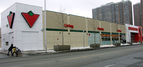
So how did they do? Seven years later, this is what the store looks like:

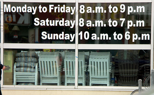
Of the six sections of the facade, four are supposed to be view-through or display windows. Of those four, one is completely obscured with white plastic film and two more are partially covered. The one remaining section that remains a true view-through window offers an uninspiring view of the backs of some chairs:

Overall, I definitely don’t get the impression of “smaller retail bays” from this storefront. In fact, I pretty much see a “continuous wall of precast concrete” that this was supposed to be an improvement on.

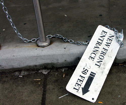
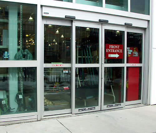
The street entrance was closed for several months starting last autumn, forcing pedestrians to enter through the parking lot entrance near the very back of the building. The sidewalk entrance was only re-opened earlier this month, though the chain and sign remain on standby, ready to close off the entrance on a moment’s notice. The handwritten correction on this sign is close to the truth: when this sidewalk entrance was closed, the only way into the store was to walk about 50 feet west, and then an additional 250 feet south to the parking lot entrance at the back of the store. “New front entrance” indeed. Just to pile on the insult, you have to walk past yet another perfectly functional door to get to the “front entrance.” I guess it’s more important to use your doorway as a shovel showcase than for, say, letting people into the store.

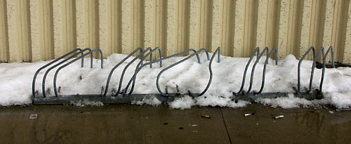
I was unable to find any bike parking on-site when I visited last week. This week, the bike rack emerged from the pile of snow by the store entrance in the parking lot. Not only is this rack in pretty poor shape, but it’s the kind designed simply to hold a bike upright, not really to lock up to securely.

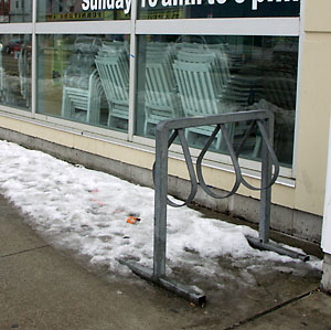
I thought these things went out with the 80s. There’s a second identical rack beside it, but in much better shape. I suppose that together, these two racks meet the requirement for bike parking. There are two lonely post and ring stands on the sidewalk in front of the store, along with this forlorn three-bike rack on the sidewalk, probably installed illegally:

What about the garden centre?

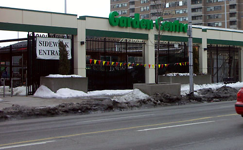
I suppose that could be called “decorative fencing,” in a “medium security chic” kind of way. There’s not much of the promised landscaping to be seen. Yes, there are scraggly trees in big concrete boxes, but I don’t really think of that as landscaping. Note the large vinyl “sidewalk entrance” sign. That’s the thing about entrances on the sidewalk — they’re so hard to find that you have to point the way to them.

This display area connected to the garden centre faces Danforth and is probably the most visible part of the store to both pedestrians and drivers. It was kept up for for a couple of years before being relegated to storage duties. Even during the gardening season, this is mostly used for storage, not retail display.
Despite the prominent streetfront location, the entire side of the building facing Danforth is very obviously the back of the store as far as Canadian Tire is concerned.
The sad thing is that all of this is really not much worse than the old store. The most prominent feature of the old storefront was a big garage door for vehicles to enter the service bays. Pedestrian access from the street was up a flight of stairs hidden behind a massive, mostly unused concrete deck. The display windows at the sidewalk were about six feet off the ground, requiring you to crane your neck to look up at the fishing rods and tools on display that week.

