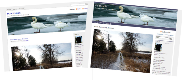
If you visit Dodgeville directly rather than through an RSS reader, you may have noticed that the site has gotten a minor redesign. The old theme, originally based on MistyLook, had served me well, but I thought it was time for a change. The new look is based on MagicBlue, a fully GPL‘d theme. The layout remains basically the same, but less dead space at the top of each page means that more content is visible on first load.
There are still a few kinks to work out, but I doubt that most people will notice. Please let me know if it displays hideously in your browser. Among other things, the new theme supports tags and makes posting galleries much easier. You’ll be seeing more of them in the future.