Much of modern design is sleek and minimalist. Unfortunately, some items are designed to be so sleek that their actual function isn’t always readily discernible. Such was the case with the office mailbox below, located directly across from the building elevator. After receiving one too many gum wrappers and coffee cups in the mail, someone taped up a notice describing the purpose of the sleek little box:
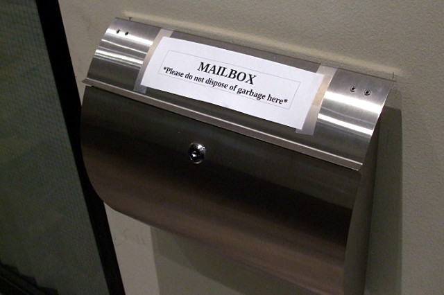
MAILBOX
*Please do not dispose of garbage here*
I frequently say that if a simple everyday object like a mailbox or garbage can requires instructions or explanations, it’s a failed design. Even well-meaning instructions can cause confusion. But all seemed well and good until another note appeared a month later, clarifying what the original note meant by “mailbox”:
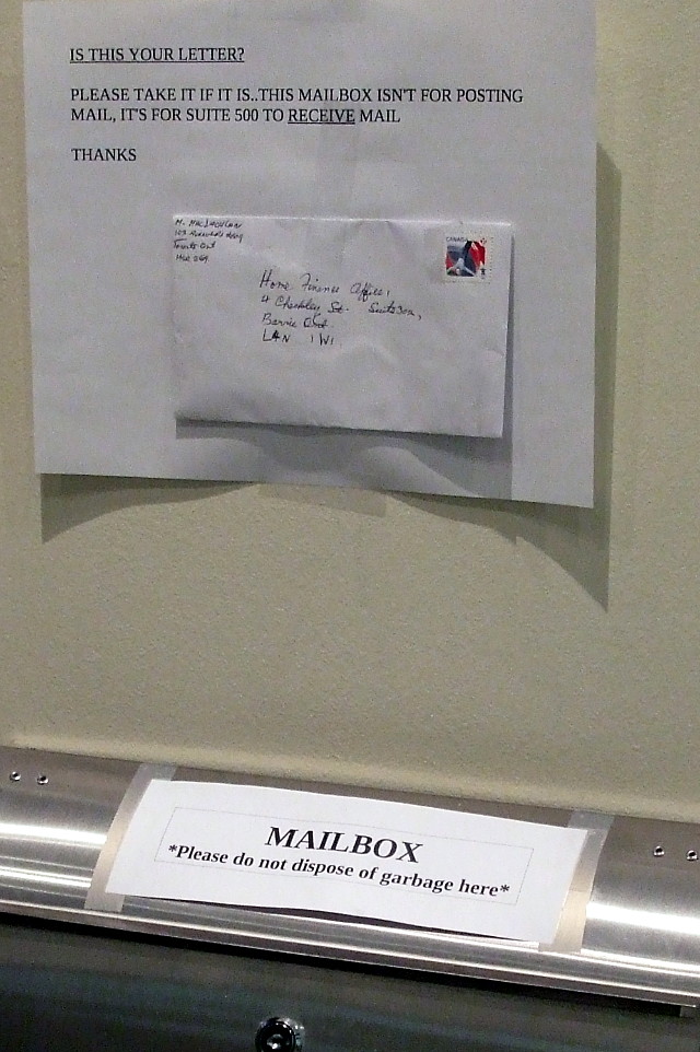
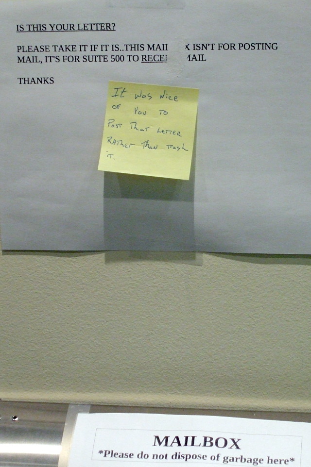
And later that day, the grateful sender retrieved the wayward piece of mail and left a thank-you note:
Only in Toronto.