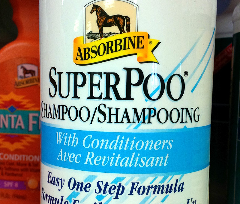
It may include conditioners, apply in just one step, and be apple-scented, but I’m just not convinced I’d want to clean my horse with SuperPoo.
Tag: advertising
The worst Christmas present ever
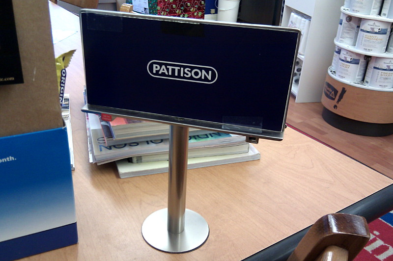
I can’t imagine giving someone a worse Christmas present than a replica billboard complete with ad company branding.
“Uh, what’s this, Mom?”
“Why, little Ginny, it’s the gift of selling your eyeballs to the highest bidder. Now go read those nice banner ads your father got for you.”
(Seen in December in a paint store that wasn’t—I think—selling it. )
How to destroy your page view rate
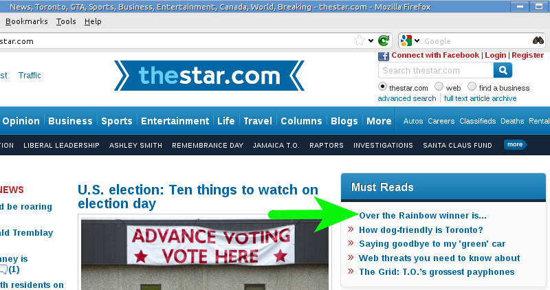
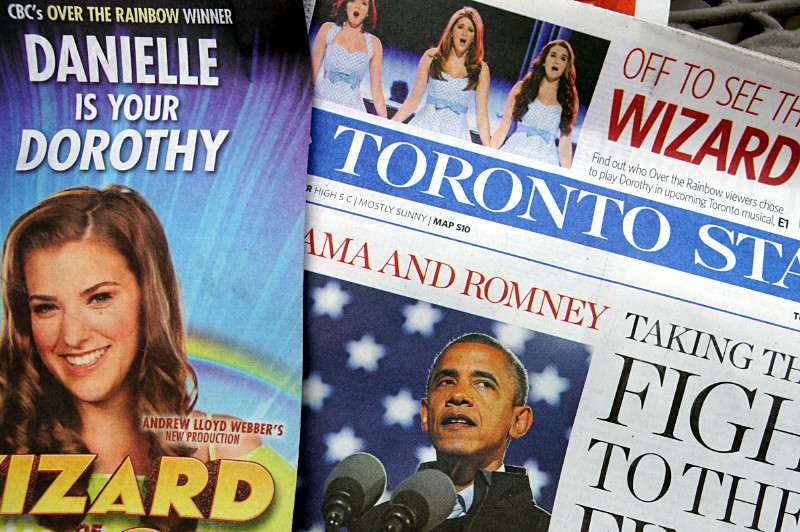
To help drive traffic (and thus ad revenue), a lot of websites tease their stories on the front page either by cutting off the story just before the salient part or by writing an ambiguous headline. Here’s a perfect example from the Star’s website this morning, teasing the results of last night’s Over the Rainbow on CBC:
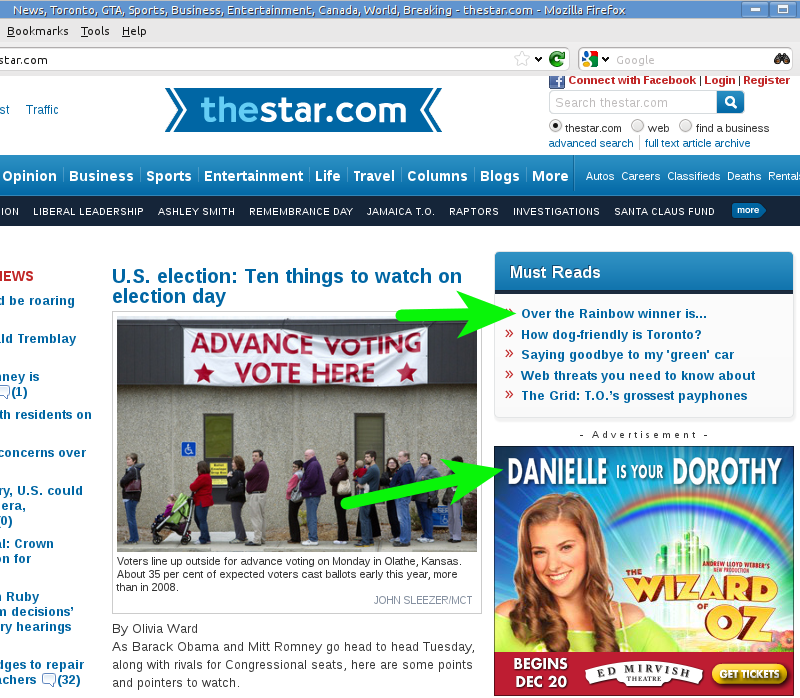
See? In an actual newspaper that was more concerned with telling you the news than selling your eyeballs to advertisers, that headline would be sporting a name in place of the ellipsis. (Indeed, the story’s URL gives it away, but many people wouldn’t notice.) Instead, you have to click through just to see the headline, right? Except that someone forgot to tell the Star’s advertisers how this whole teaser thing works:
If anyone at the Star noticed the incongruity of a teaser headline with a spoiler right underneath it, they just doubled down on the ad instead of losing the coy headline:
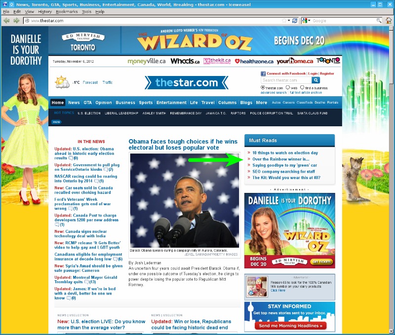
Someone really needs to tell a Star editor that there’s no point in teasing the headline if it’s surrounded by the story. Okay, a semi-silly teasing headline on a website, no big deal. That would have been that, except that the Star did the same thing in today’s dead tree edition, placing the spoiler not just on the same page as the teaser, but in a wraparound that covered the teaser up:
Neat.
Happily ever after
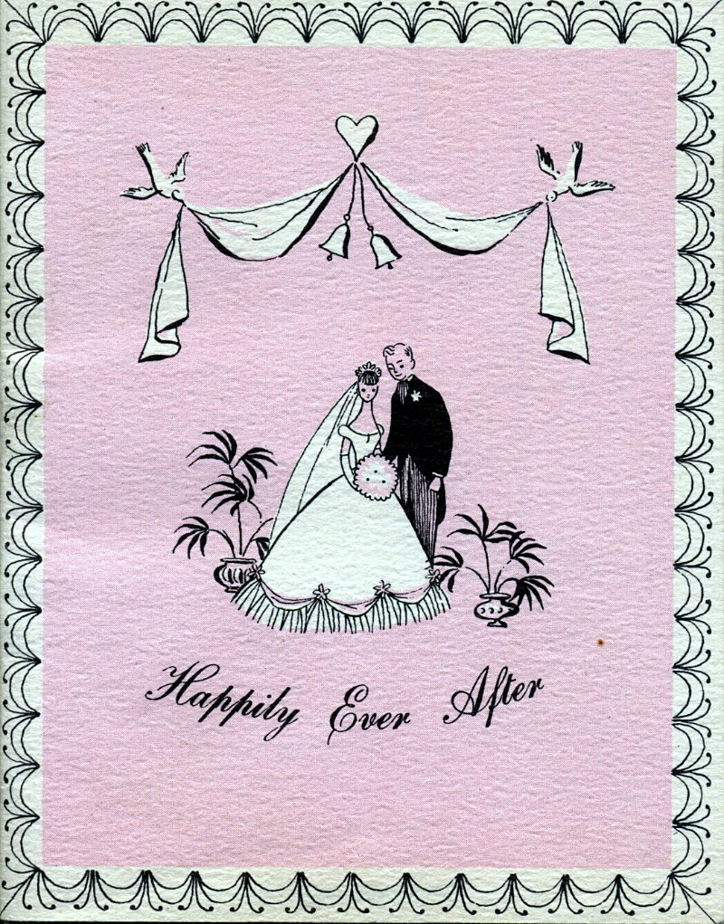
Happily Ever After: Allow Julius Schmid, Inc. to explain the secrets of a happy marriage to the new couple.
This booklet on making a happy marriage was produced by Julius Schmid, Inc. in 1956 and comes from the big treasure trove of stuff accumulated by my family over the last century.
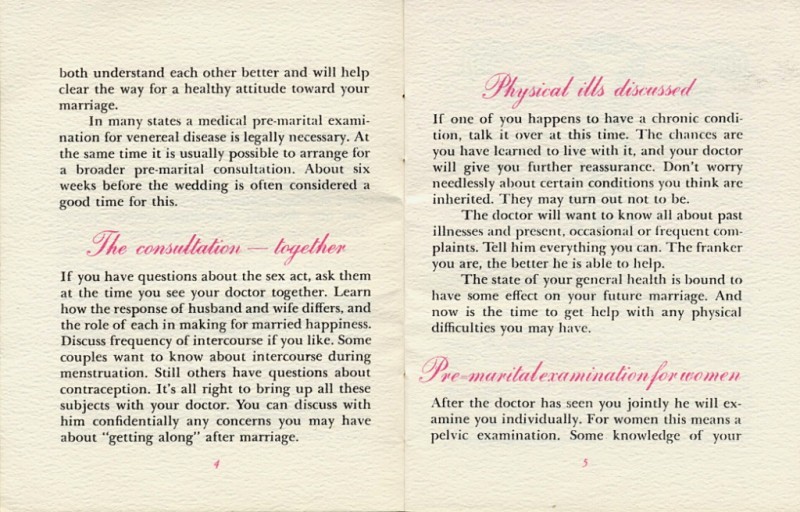
The booklet is ostensibly a guide that steps a soon-to-wed couple through an initial consultation with their doctor, where the MD will explain the proper sexual role and expectation of each partner in a happy marriage, as well as moderate discussions about frequency and duration. It’s published by the makers of Ramses and Fourex condoms and is obviously a subtle marketing vehicle, probably distributed solely in doctors’ offices, and almost certainly the most direct birth control advertising that was allowed at the time.
Looking back through old documents like this, it’s hard for the casual observer to tell for sure whether the era was really so wildly different from today, the author was hopelessly naive, or the company was winking and nodding while playing along with the sensibilities of the time in order to market its product. I suspect it’s a combination of all of the above, though it’s mostly nodding and winking as Julius Schmid surely would have expected most of these to end up in the hands of curious teenagers. Either way, it’s interesting to compare the condom marketing of 1956 with the ads on TV today.
Incidentally, if this booklet came to my family at the time of its publication rather than being a later novelty acquisition, it dates from the time when my mother was nine years old and my grandmother was embarking on her second marriage. Which, in either case, ewww.
Scans of the complete booklet are below the fold.
Coincidence
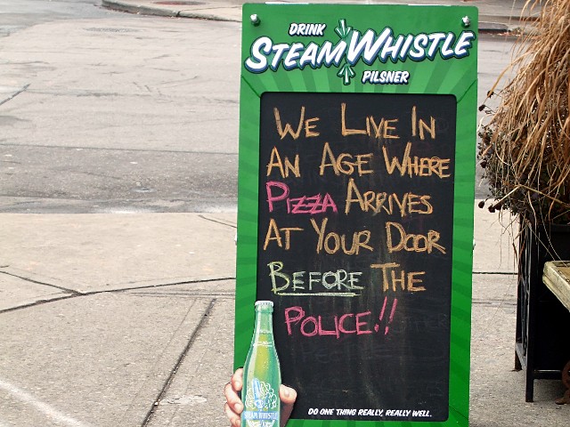
I saw this sidewalk sign outside a restaurant on Danforth when I walked past around 2 p.m. on Friday afternoon:
At the same time on Friday afternoon, a woman in Vaughan called the police about a home invasion and they took 50 minutes to respond. Maybe she should have told the cops she’d order some pizza for them. But the real question is, exactly what and when did the sign writer know? I smell an inside job.
Advertising good, bikes bad
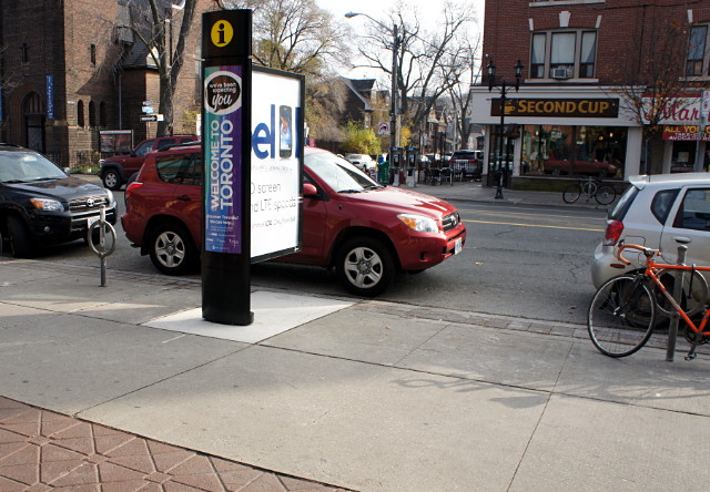
Enough has been written about these stupid info pillars elsewhere that I won’t bore you with another diatribe against their design or the questionable process that resulted in the city being saddled with them in the first place. This one is in front of Carrot Common on Danforth and in addition to looking ugly, replaced a perfectly good post and ring bike rack, as seen by Google Street View: 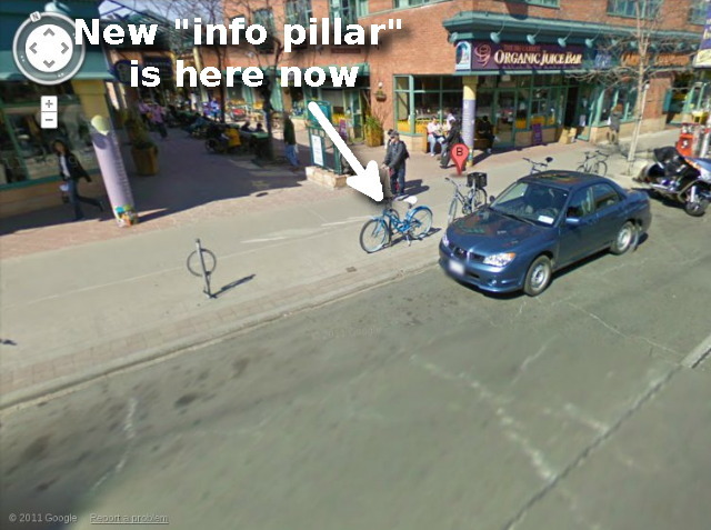
I’ve written to my councillor to ask why parking for two bikes was removed so that Astral could place two giant ads on the sidewalk. It’s almost impossible to find bike parking in this area during the summer and only marginally easier during the spring and fall. We need many more racks here, not fewer. I don’t think that drivers or merchants would quietly stand by if they lost two car parking spots to a billboard, and I don’t see why cyclists should be expected to do so either.
The first ad of thermodynamics
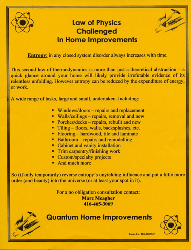
I toss the vast majority of flyers we receive straight into our oversized recycling bin, but this one caught my attention:
Any contractor who invokes thermodynamics in his advertising—indeed, makes it central to his sales pitch— deserves at least some consideration the next time we’re having work done.
What a bargain
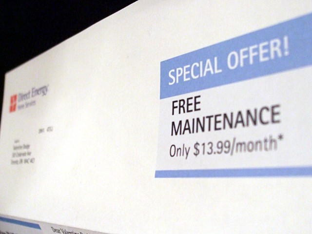
I’m used to receiving “free” offers in the mail, but rarely is a company—especially one as large as Direct Energy—as upfront about just how much free is going to cost me. I’m not even sure why they bothered putting the asterisk there; it seems pretty clear even from the large print that I’d have to be pretty daft to take advantage of this offer.
Bonus: I have no idea what Bucknuts are or how they allow Direct Energy to offer “competitive energy solutions.” They really don’t sound like something I’d want to burn for heat in the winter.
