Waterfront Trail expanding to Lake Erie

The Waterfront Regeneration Trust, which manages the Waterfront Trail along the length of Lake Ontario, is expanding it to include the Lake Erie shore starting next year. This has probably been in the works for a while, but the news seems to be flying below the radar so far.

I don’t expect the trail to emerge next spring as a finished entity along the entire Lake Erie shore, but adding 620 km of signed on- and off-road trail is a huge step forward. A lot of cyclists in Ontario (myself included) salivate at the thought of our own Route Verte connecting the corners of the province. A lot of the infrastructure is already in place, with numerous long-distance trails radiating across many regions of the province. Some of them are already managed as pieces of larger trail networks like the Waterfront Trail, the Central Ontario Loop Trail, and the Trans Canada Trail. Still, completing a provincial network wouldn’t be trivial: some trails would need to be need to be improved to be suitable for casual cyclists and filling in the missing links would need to be prioritized. Closest to home, Toronto suffers from relatively poor connections to out-of-town trails. The Waterfront Trail is nice, but won’t get you to the numerous bike routes that start north of the city. That’s one reason I like the hydro corridors so much: they’re quiet routes through the most car-centric parts of the city and have tremendous potential for linking to trails beyond Toronto’s boundaries. We need more of them.

With the Lake Erie extension, I hope that the Waterfront Trust has learned some lessons from 15+ years of wrangling the trail along Lake Ontario. Here are two improvements I’d like to see applied to the trail on both lakes:

  • Follow an obvious and sane route. I’ve ridden the Waterfront Trail through Oakville a number of times and have never been able to follow the official route. It seems to constantly duck onto short side streets for one or two blocks before coming right back up to Lakeshore Road. The route may travel one block through a park that is otherwise two blocks away from the through-route. The little jogs just add distance and confusion to the overall route and make it incredibly easy to get lost. The situation is the same in parts of St. Catharines, Toronto, and probably elsewhere. I’d much rather just have a relatively straight route than one that takes me two blocks out of my way so that I can ride for one block on a quiet street that’s still nowhere near the water. A cyclist shouldn’t need to consult a map to follow a signed route, any more than a driver should need a map to drive straight on the 401.
  • Have more visible and more consistent signage. One of the reasons it’s so easy to lose the trail as it zigzags from street to street is that many directional signs are so small that they border on invisible. The small size is compounded by the fact that many directional arrows are pale orange on a tan background and don’t exactly call your attention to them. You’ll never see one unless you’re actively looking for it. I understand that there was some NIMBY resistance in the early days of the Waterfront Trail, but surely it’s well-established now and can push communities for better signage. Signs have improved in a lot of areas, but there’s still much work to do.
Vote for me!

[Update, Monday, November 19: The voting period has been extended by two days until Wednesday. I can only assume that Don and Humber are racking up too many votes for Metrolinx to count them all. Also, it can’t bode well for my receiving my fabulous prizes if they’re already deviating from the published contest rules. I suspect my winnings will be whittled down to just half of the originally promised nothing. Or possibly even less. Still, remember that your vote will ensure our combined victory. Original post from November 14 follows.]

I don’t usually deploy this blog’s legions of fans (and by legion, I mean three old guys sitting on stools in the corner) for nefarious purposes, but I’d like to encourage everyone to go to the voting page for the Crosstown LRT’s tunnel boring machines naming contest and vote for the entry that I submitted, Don and Humber. Just one vote per person, and voting ends on Monday at 4:00 p.m.

What was my inspiration for Don and Humber, you ask? Disappointment with the names for the current TBMs tunnelling the Spadina subway extension moved me to action. I suppose that Torkie, Yorkie, Holey, and Moley are good enough names, but nothing about them really screams “Toronto” to me. Okay, “Yorkie” is sort of a shout-out to history and the subway’s destination, but it’s just a bit too cutesy when combined with its mate, Torkie. Holey and Moley are so generic that they might as well be menu items at Tim Horton’s. In contrast, Don and Humber are two rivers that have historically defined Toronto and are each relatively close to the end points of the Crosstown tunnels. See what I did there? A historically important pair of names, relevant to the project at hand, and instantly recognizeable to any Torontonian. What could be better?

Only one of the other semi-finalists, “Dennis and Lea” takes its entry from something local (the Mount Dennis and Leaside neighbourhoods at the ends of the tunnels). That seems obscure enough that no one will get it. Even Google thinks that “Dennis and Lea” is a reference to the failed engagement between Dennis Quaid and Lea Thompson a quarter of a century ago. Seriously, who’s going to vote for that?

And what riches await if my names are chosen? The grand prize consists of “recognition through […] a press release” and has “no monetary value.” The prize is also non-transferrable and, yes, I have to answer a skill-testing question to claim it. And naturally, Metrolinx “reserves the right to substitute a prize of equal or greater monetary value” should they be unable to award these unfathomable riches, so I could just get a big cup of nothing—minus the cup and the press release. Vote early, vote often once, and spread the word if you’re so inclined.

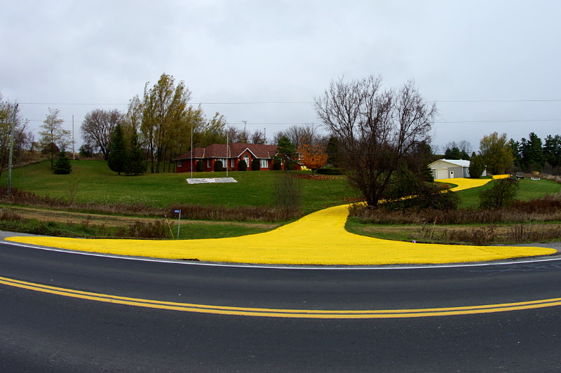
Follow the yellow (asphalt driveway)

Driveway painted yellow

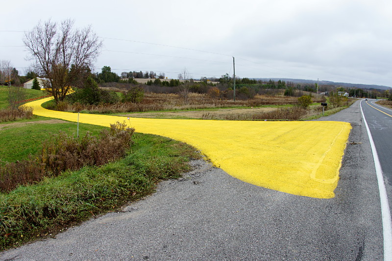
Driveway painted yellow

When they’re located on a high-speed rural road a couple of kilometres away from any real landmarks, homeowners can sometimes have difficulty giving directions to visitors not familiar with the area. Some try to use distances in minutes or metres (“One minute south of Bailieboro on 28,” “four and a half kilometres north of County Road 9,” and so on), but such measurements tend to be either imprecise or inconvenient. Others put up their own landmarks to guide visitors: lawn ornaments, rock gardens, and flagpoles are among the more common examples. But some homeowners take a more direct route when it comes to giving directions: there’s just no mistaking “turn at the giant yellow driveway” for some other location.

(Freshly painted starting three weeks ago, as seen on County Road 28 about two kilometres south of Bailieboro, or twelve minutes north of the Transformers. Look for the giant yellow driveway.)

Autobots, roll out!

It’s hard to imagine something more impressive than the sight of a Transformer, Bumblebee, standing at the side of the road in Port Hope:

Bumblebee guards the road


Fortunately, you need only turn your head to see something far more impressive:

Optimus Prime stands guard

Primitive Designs in Port Hope always has something unexpected on display for passers-by on County Road 28. Last year, it was a Toronto Moose. This year, a two-storey-tall Optimus Prime and his merely human-sized companion, both made of car parts, grace the store entrance. An employee hinted that more may be on the way for next year. A fellow gawker was standing there all agog, barely able to string together a coherent sentence while standing in Optimus Prime’s shadow.

I can’t really say anything else other than to get thee on a day trip to Port Hope post-haste to check them out. The amount of work that went into them is incredible, as seen in this detail from Optimus Prime’s leg:

Detail of Optimus Prime's leg at Primitive Designs

How to destroy your page view rate

To help drive traffic (and thus ad revenue), a lot of websites tease their stories on the front page either by cutting off the story just before the salient part or by writing an ambiguous headline. Here’s a perfect example from the Star’s website this morning, teasing the results of last night’s Over the Rainbow on CBC:

Teaser headline in the Star

Who could have won? I must click through.

See? In an actual newspaper that was more concerned with telling you the news than selling your eyeballs to advertisers, that headline would be sporting a name in place of the ellipsis. (Indeed, the story’s URL gives it away, but many people wouldn’t notice.) Instead, you have to click through just to see the headline, right? Except that someone forgot to tell the Star’s advertisers how this whole teaser thing works:

Spoiler on page 1

Never mind, I got it.

If anyone at the Star noticed the incongruity of a teaser headline with a spoiler right underneath it, they just doubled down on the ad instead of losing the coy headline:

The Star giveth away

I said I got it.

Someone really needs to tell a Star editor that there’s no point in teasing the headline if it’s surrounded by the story. Okay, a semi-silly teasing headline on a website, no big deal. That would have been that, except that the Star did the same thing in today’s dead tree edition, placing the spoiler not just on the same page as the teaser, but in a wraparound that covered the teaser up:

The Star is giving it away.

Want to find out who won? Please buy this paper and turn to page E1. Try not to look to the left.

Neat.

Insert what into where?

Insert disk graphic displayed on IBM server at boot

Kids these days may not recognize two of three things in this graphic.

I was greeted by this delightfully retro high-ASCII graphic last week when first booting up a new(-ish) IBM server to install an operating system. The only thing that would make it better would be displaying a 5.25″ floppy instead of a 3.5″ disk. It can only be a matter of time before hipsters start carrying floppies around because they’re more authentic than USB keys.

This server certainly didn’t have a floppy drive but I should count myself lucky: the operating system I was installing would have required shuffling more than 1,250 1.44 MB disks.

Doll on a dock

Doll on a dock

Is that a rod in your hand or are you just happy to see me?

People put the darnedest things on their docks. I hope he’s just holding the broken end of a fishing rod and not, uh, well, um, whatever it is that boys do when they pack up their satchels to spend a solitary afternoon by the river…

Fixing Mammoliti

A lot of ink and bluster have been spilled over yesterday’s confrontation between Councillors Giorgio Mammoliti and Gord Perks. I won’t add to it other than to say that Jack Lakey, the Star’s Fixer, wrote a blog post detailing a spat between his younger self, when he worked the City Hall beat,  and Mammoliti:


At one point [Mammoliti] told me – in front of other people in the council chamber – that I wrote the stories because I was anti-Italian. And then he walked away.

I was livid, not just at the comment, but at his timely evacuation of the danger zone.

In those days, I was a lot more jumped up and charged with testosterone. It was a serious challenge not to chase him down.

I called aside his executive assistant at the time, a good guy named Anthony Cesario, and asked him to pass along a message to George: If he ever said anything like that again, I’d drop him.

I was quite capable of it, and George knew it; he never came near me for months afterward.

If he’d followed through, Lakey would certainly have come to be known as The Fixer, but different reasons than he is now.