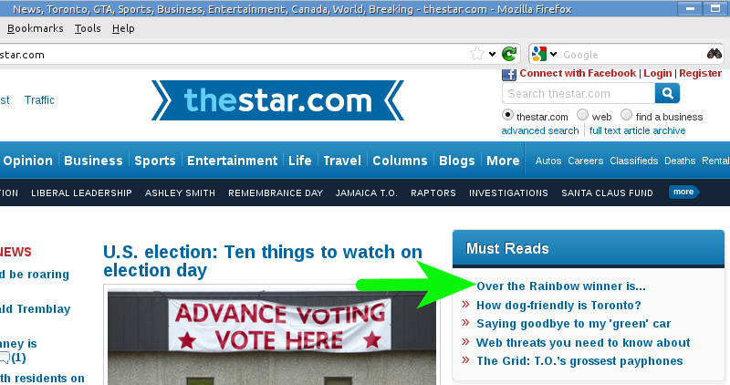
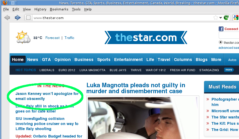
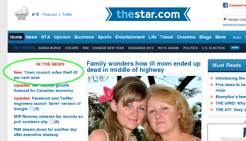
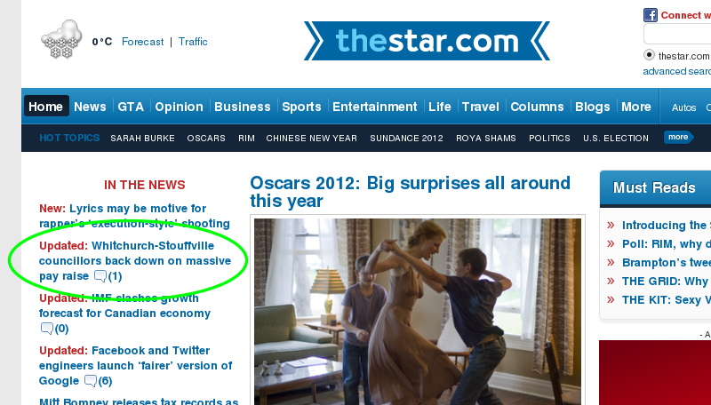
To help drive traffic (and thus ad revenue), a lot of websites tease their stories on the front page either by cutting off the story just before the salient part or by writing an ambiguous headline. Here’s a perfect example from the Star’s website this morning, teasing the results of last night’s Over the Rainbow on CBC:
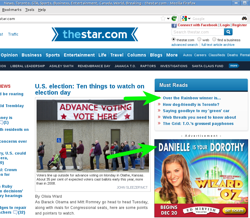
See? In an actual newspaper that was more concerned with telling you the news than selling your eyeballs to advertisers, that headline would be sporting a name in place of the ellipsis. (Indeed, the story’s URL gives it away, but many people wouldn’t notice.) Instead, you have to click through just to see the headline, right? Except that someone forgot to tell the Star’s advertisers how this whole teaser thing works:
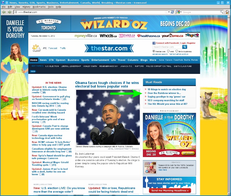
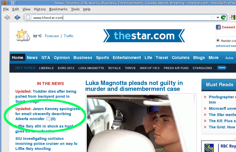
If anyone at the Star noticed the incongruity of a teaser headline with a spoiler right underneath it, they just doubled down on the ad instead of losing the coy headline:
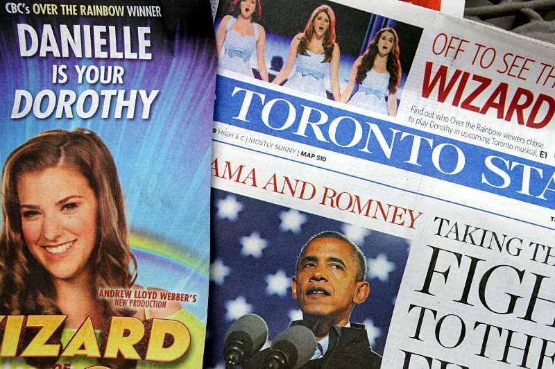
Someone really needs to tell a Star editor that there’s no point in teasing the headline if it’s surrounded by the story. Okay, a semi-silly teasing headline on a website, no big deal. That would have been that, except that the Star did the same thing in today’s dead tree edition, placing the spoiler not just on the same page as the teaser, but in a wraparound that covered the teaser up:
Neat.
