Another TTC ghost stop

East face of TTC ghost stop on Gerrard at Jones

Here’s another TTC ghost sign, this one on the northeast corner of Gerrard Street at Jones Avenue. The east face, above, is hard to miss. The west face is much more faded but the “AR S” of “CAR STOP” is still barely visible. In the photo of the west face below, you can see the bright white rectangle of the original sign as well as very faint outlines of the “R” and “S” just above and below the big rust patch in the middle of the post:

West face of TTC ghost stop on Gerrard at Jones

A little farther east on Gerrard there’s also a ghost Sunday stop, but it’s only visible as an area of faded yellow paint on a utility pole with no discernible lettering.

TTC ghost stops

TTC ghost sign on Sloane at Eglinton

Before the TTC started marking bus stops by strapping mass-produced metal* vinyl signs onto poles, they used stencils and paint. I’m not sure when they stopped doing that, but I do vaguely remember the metal signs becoming standard in maybe the early 80s. Most of those old painted signs have disappeared or faded with time, but a few of them are still kicking around on old streetcar and bus routes. The one above is painted on an old utility pole on the east side of Sloane Avenue just north of Eglinton Avenue East. The old pole has been cut down to just above the ghost stop, leaving it with no role other than displaying a bit of old paint. As you can see in this Google Street View, the metal sign was strapped over the painted one before the new pole was installed.

Another TTC ghost is on the southwest corner of Kingston Road and Glen Manor Drive:

TTC ghost sign on Kingston at Glen Manor

As you can tell by the snow on the lawns in the background, the picture wasn’t taken this winter. It looks like this stop was originally on a TTC-specific pole that carried the trolley wire for powering streetcars on this line. I’m not sure why the old pole survived; like the one on Sloane above, it seems to serve no specific function any longer.

Without a doubt, the best TTC ghost stops were in the Wychwood streetcar barns, where decommissioned poles were cut up and used as building material to shore up the floor above:

TTC ghost stops holding up the floor in the Wychwood car barns

It’s extremely unlikely that any part of these ad hoc posts and beams survived the conversion of the buildings into the Artscape Wychwood Barns, but it was an amazing surprise to see when it was there.

* Update, March 16, 2012: The newer non-painted signs are actually vinyl, not metal.

Logan Furniture ghost sign

Logan Furniture & Appliances ghost sign on Danforth Ave.

Logan Furniture & Appliances ghost sign on Danforth Ave.

A great ghost sign was uncovered on the Danforth at Chester Avenue last week. The sign for Logan Furniture & Appliances had been hidden behind the facade of Parthenon Jewellery, which closed last year. A small corner of the ghost sign was revealed after a pop-up store hung its shingle for a few weeks leading up to Christmas, and the entire old sign was uncovered just a few days ago.

Worth noting is the old-style phone number giving the exchange name of HO (HOward) for the first two digits. Also worth noting is that even back then, “easy credit” was a big selling point.

Same path, same day, different rules

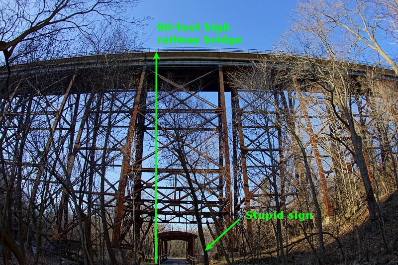
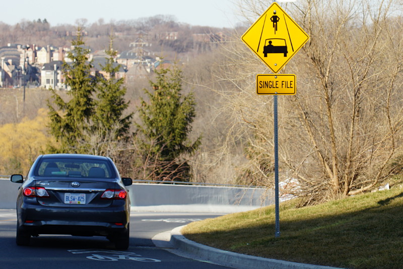
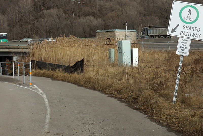
In Taylor Creek Park near the forks of the Don, a raised pathway was installed a while ago so that pedestrians and cyclists wouldn’t have to contend with vehicular traffic on the park roadway. When you’re heading east into the park, the shared path beckons to cyclists, explicitly declaring that it’s “open for bikers [sic] and pedestrians”:

Welcome, eastbound cyclists.

But at the other end of the path, cyclists heading west out of the park are sternly instructed to dismount:

Go away, westbound cyclists.

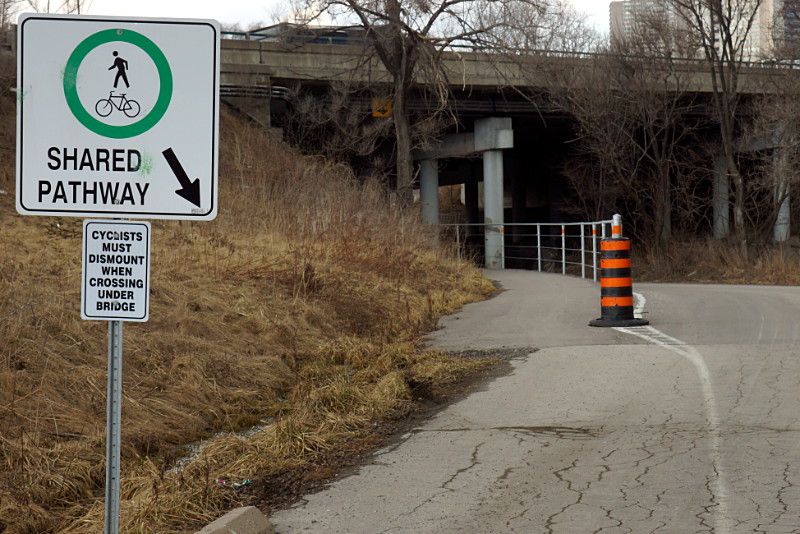
To be clear, this is the same “shared pathway,” only about 100 metres long, and built with the express purpose of giving safe passage under the Don Valley Parkway away from cars on the park road. And although it’s signed as a shared pathway at both ends, it seems that only eastbound cyclists are actually allowed to ride their bikes.

If the pathway is too narrow to allow cyclists to ride in both directions while mingling with pedestrians (an assessment I wouldn’t disagree with), or if there’s a blind corner that makes riding full-bore unsafe, why weren’t those issues addressed during design and construction? Or better yet, why not just mark it as a pedestrian walkway and encourage cyclists to just take the road, which is the route still chosen by the vast majority of cyclists anyway?

Ironically, the raised path would be of most use to westbound cyclists because it doesn’t dip as low under the bridge as the roadway does, making the short hill on the far side easier to climb. Yet it’s westbound cyclists who are singled out for dismounting. Personally, I think that if the city wants this passage to be safer, it should instruct drivers to get out of their cars and push. After all, there’s a blind corner and the lanes are a little narrow…

The worst sign in Toronto

Toronto may be home to the occasional good sign, but it also features a distressingly large concentration of bad signs. Their badness runs the gamut from enforcing bad rules to ignoring reality to being mistaken to just plain lying. I thought that a lifetime of studying Toronto’s dizzying array of bad signs had prepared me for anything, but I was flabbergasted when I saw this one on the path in the Charles Sauriol Conservation Reserve:

Stupid CP sign

What makes this sign the worst in Toronto is not so much the meaningless legalese (I’m about to enter a “License Area”? I’d be happy to ask someone at CP what that means, but I’m just out for a stroll in the park.), nor its placement in a quiet park, and not even the fact that it’s the first sign I’ve seen after two hours of hiking up the Don Valley. No, what makes this the worst sign in Toronto is the context:

Stupid CP sign in context

Okay CP, I get that we’re crossing your right of way at our own risk and all that. But seriously?

I hate to break it to you, Joe…

Still hopeful a year later.

…but you lost the election. Well over a year ago. It’s probably time to take down that sign on your Bloor Street East campaign headquarters.

But if flying a flag upside down is the symbol for a ship in distress, then this sign displayed elsewhere on the same building speaks pretty accurately to your campaign:

International symbol for a mayoral candidate in distress

Every time I walk past these signs I wonder if there’s an equivalent to “nerkle” for people who leave election signs up long past their relevance date.

The travails of Mr. Stickman

[This is a repost of an article that I originally put together for Torontoist in 2008. Torontoist’s recent redesign seems to have eaten all of the photo galleries in older posts, so I’m adding this one here because it was way too much fun (and work!) to allow it to disappear into the ether.]

Trucks are just one of Mr. Stickman's many nemeses.

Mr. Stickman has the toughest job in Toronto: keeping you safe. In a day’s work, he gets smushed, crushed, beheaded, befingered, mangled, strangled, thrown, blown, ground, and crowned. And unlike the relatively delicate spokesmodels who calmly remind you to mind the gap or use proper escalator technique, Mr. Stickman is willing to give the extra effort and actually demonstrate the consequences of not following the rules. Wherever danger lurks, Mr. Stickman plies his educational trade. He endures every manner of indignity, accident, and disfigurement that you can imagine, all in the hope that you will learn from his painful and sometimes deadly misadventures. What follows is a small sampling of his daily work around Toronto.

Read More …

Coincidence

I saw this sidewalk sign outside a restaurant on Danforth when I walked past around 2 p.m. on Friday afternoon:

We live in an age where pizza arrives at your door before the police

At the same time on Friday afternoon, a woman in Vaughan called the police about a home invasion and they took 50 minutes to respond. Maybe she should have told the cops she’d order some pizza for them. But the real question is, exactly what and when did the sign writer know? I smell an inside job.

The problem with modern design and ambiguous instructions

Much of modern design is sleek and minimalist. Unfortunately, some items are designed to be so sleek that their actual function isn’t always readily discernible. Such was the case with the office mailbox below, located directly across from the building elevator. After receiving one too many gum wrappers and coffee cups in the mail, someone taped up a notice describing the purpose of the sleek little box:

This is a mailbox not a garbage can

MAILBOX
*Please do not dispose of garbage here*

I frequently say that if a simple everyday object like a mailbox or garbage can requires instructions or explanations, it’s a failed design. Even well-meaning instructions can cause confusion. But all seemed well and good until another note appeared a month later, clarifying what the original note meant by “mailbox”:

This mailbox is for receiving, not sending

And later that day, the grateful sender retrieved the wayward piece of mail and left a thank-you note:

Thanks for not throwing out my letter

Only in Toronto.