The Star fesses up

Kathy English, the Star‘s public editor, dedicated her column today to addressing my complaint about headline switching on its website.

In her column, English reported that the journalist who wrote the story had misunderstood the council vote and only realized her error after the story went live on the Star‘s website. The reporter and her editor updated the online story and headline without noting the significant change in the article. I’m not sure if that’s any better than my original thought on seeing the flip-flop, which was that the Star had prepared two headlines and accompanying stories in advance and had simply posted the wrong one. Neither option is an excuse for not posting a correction on something like this.

Clarifying that the Star‘s corrections policy does apply to the web site, English wrote:

The Star’s accuracy and corrections policy applies to all content on all platforms. It says that errors, in print or online, must be corrected clearly, promptly and prominently. It also states, “Building trust in the digital world demands that the Star is seen to be transparent.”
[…]
In recent months, I’ve grown increasingly concerned about the Star’s level of transparency about online errors, having come across far too many examples of the newsroom “fixing” stories without acknowledging mistakes.

I’m quite surprised to discover that the Star‘s corrections policy holds the website to the same standard as the print edition, and can only assume that its requirements are disregarded by a significant proportion of Star writers and editors. I’ve lost count of how many silent corrections I’ve seen on the Star‘s website. I may laugh at spelling mistakes and nonsensical sentence fragments, but getting a story plain wrong and then not owning up to it is just too much.

Call me old-fashioned, but I believe that online media should be held to the same standard as any other media when it comes to accuracy. When an error is made, a correction should be noted and published. Both online-only publications like Slate and traditional broadsheets like the New York Times adhere to this standard for web content. Locally, Torontoist started doing it in January 2008 under then Editor-in-Chief David Topping and remains one of few, if not the only Toronto media outlet that reliably appends public corrections to articles that originally contained errors ranging from misspelled names or misstated dates all the way up to mistaken facts. It’s kind of sad that four years on, major media in this town is still catching up.

Cottonwood Flats ice curtain

Ice curtain around the Don River

There’s an interesting sight on the Don River north of Pottery Road. Just across the river from Cottonwood Flats, a series of icicles dripping from the hillside create an ice curtain that curves for about 200 metres along the river bank.

Ice curtain around the Don River

Although a few of the individual icicles can be traced to water channels that trickle down from the top of the hill, most seem to sprout from the hillside just a few metres above the river:

Ice curtain detail

Given the extent and uniformity of the ice, my guess is that most of it comes from groundwater seeping into the river at this location.

A cafe for the ages

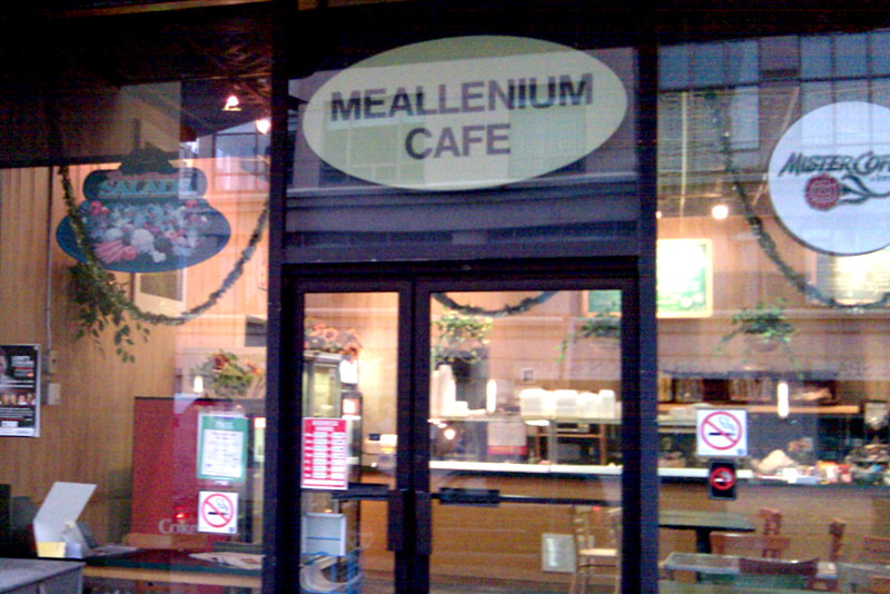
Meallenium Cafe

On Yonge Street at Aylmer Avenue, the Meallenium Cafe serves up food for the ages. Or aged. Or something. The name may seem a little anachronistic given that we’re currently twelve (or eleven, depending how you count) years removed from the millennium celebrations, but keep in mind that we’re barely 1% of the way through the current millennium. The name will be fresh for at least another 300 years.

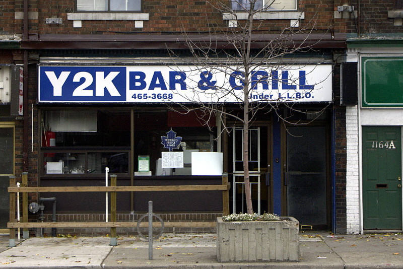
One name that was instantly anachronistic was anything that referred to Y2K. Most perplexing of these to me was the Y2K Bar & Grill on the Danforth which not only first appeared well after Y2K, but persisted until just a couple of years ago:

Y2K Bar & Grill

The Star tries to make up its mind

[January 28 update: the Star‘s public editor addressed my complaint in her column today. Here’s my reaction.]

[January 26 update: the Star finally prepended a correction to the article yesterday, more than a full day later. I’ll have more to say about it in a couple of days.]

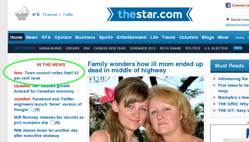
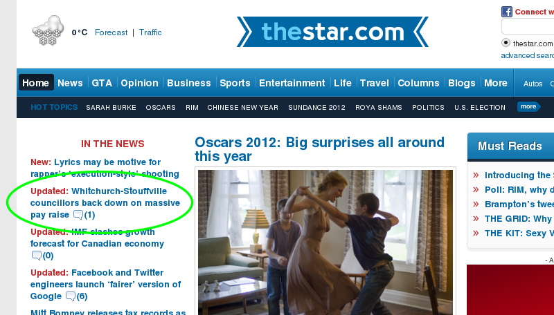
Although the Star is somewhat notorious for its editing mistakes, it’s not often that you see the same story covered under two completely contradictory headlines. But such was the case today when a story about a raise for town councillors in Whitchurch-Stouffville first appeared and was later updated:

Town council votes itself a giant raise. Or not.

Half an hour later:

Town council votes itself a giant raise. Or not.

I didn’t have a chance to read the first version of the story, but it’s clear that at least a couple of the early commenters on the article saw a story about a 43% raise. Based on the headline alone, a correction should be appended to the online article. No such luck. It’s worth noting that the URL for the story also changed, from:

http://www.thestar.com/news/article/1120332–whitchurch-stouffville-council-votes-itself-43-per-cent-raise?bn=1

to:

http://www.thestar.com/news/article/1120332–whitchurch-stouffville-councillors-back-down-on-massive-pay-raise?bn=1

Both URLs currently take you to the same version of the story, but that’s only because to the Star‘s chosen content management system, this is also a valid link to the story:

http://www.thestar.com/FakeNews/article/1120332–the-toronto-star-cant-get-its-story-straight?bn=1

A lot of minor corrections are fixed silently and go unnoticed, but an error on this scale requires some sort of acknowledgement.

I’ve written an email to the Star‘s public editor, Kathy English, in the hope that this kind of situation may be addressed in the future.

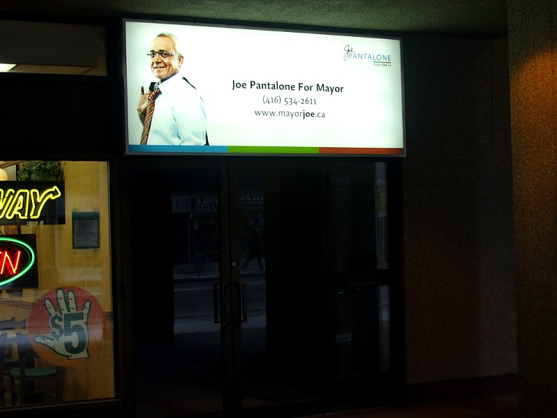
I hate to break it to you, Joe…

Still hopeful a year later.

…but you lost the election. Well over a year ago. It’s probably time to take down that sign on your Bloor Street East campaign headquarters.

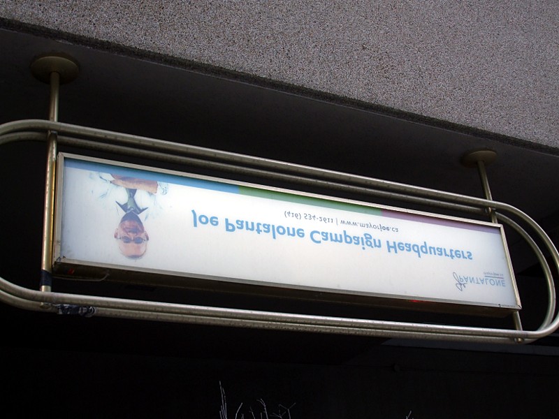
But if flying a flag upside down is the symbol for a ship in distress, then this sign displayed elsewhere on the same building speaks pretty accurately to your campaign:

International symbol for a mayoral candidate in distress

Every time I walk past these signs I wonder if there’s an equivalent to “nerkle” for people who leave election signs up long past their relevance date.

No admission

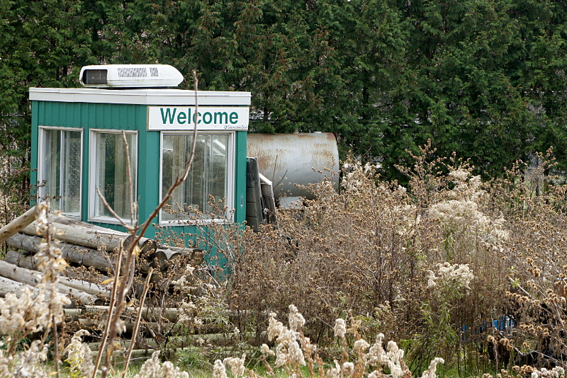
Toronto Zoo admission booth

A Toronto Zoo ticket booth, accompanied by a pile of logs, an oil tank, and other assorted detritus, sits abandoned in an overgrown field near the zoo’s rear entrance. I guess this is the zoo’s basement: just shove everything there that they don’t really want at the moment, but can’t quite bring themselves to get rid of.

Pottery Road improvements revisited

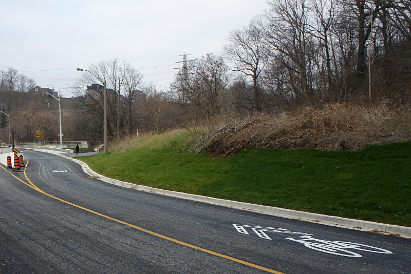
Sharrows on Pottery Road

When Pottery Road re-opened at the end of November, cyclists and pedestrians rejoiced. So did drivers, but their joy was a little tempered. As a cyclist, I have nothing but praise (well, almost nothing but praise) for the outcome of the project, but I’ve heard a lot of complaints from drivers. Their concerns fall into two broad categories: why are these new traffic lanes so narrow, and what the hell are these bike symbols in the middle of the road? I first heard the former complaint from Risa, who drives down Pottery Road to work every day. I’ve since heard it from numerous others too. The latter complaint first came to the attention of Ward 29 Bikes via an email from a police officer who was recommending that the sharrows be removed because they confused motorists and encouraged cyclists to ride down the hill in the middle of the lane (which is kind of the whole point of them). He went on to explain that some motorists thought the sharrows indicated that they were driving in a bike lane. To get out of this supposed bike lane, they tried to do u-turns on the hill. I thought that was a joke when I first heard it, or at least an exaggeration to make some kind of anti-bike point. But after I heard the same thing elsewhere, I thought there might be a grain of truth in there after all.

My first instinct is always to cast aside such tales as just part of the general grumpiness that accompanies any cycling infrastructure in this town. But after giving it some thought, I realized that drivers probably do have a legitimate problem with sharrows: they have no idea what a sharrow is. Although sharrows are explained over and over again on the city’s cycling website, in the city’s cycling newsletters, and at public meetings about cycling infrastructure, those audiences always consist of cyclists. I couldn’t recall sharrows ever being explained to drivers. Explanations aren’t included when you renew your licence, there are no explanatory signs beside the road, and no one holds public meetings explaining new cycling infrastructure to motorists. Whenever a new stop sign or traffic light appears, a big “NEW” sign is placed somewhere in the block leading up to it. Bike lanes, HOV lanes, bus lanes, turning lanes, crosswalks, and even parking spots all come with accompanying overhead or roadside signs. In contrast, sharrows just appear out of nowhere without any explanation. That may be fine on streets like Wellesley where they form short connectors near intersections between sections of the bike lanes, but there is no similar context on Pottery Road, where they appear mysteriously at the top of the hill and disappear just as enigmatically at the bottom of the hill.

When you’re inside the bubble of cycling information, it’s easy to forget that the memo was never really sent to the general public. Unless you are relatively active in the cycling community or visit www.toronto.ca/cycling once in a while, you probably have no idea what a sharrow is or what it’s supposed to indicate. What’s needed here is driver education, not removal of the sharrows. Fortunately, as reported on OpenFile last week, the city will be putting up signs in the spring explaining the shared lane markings.

As for the narrow lanes, having driven up and down Pottery Road a few times myself, I agree that the lanes are narrower than they used to be. I could even be convinced to admit that I may feel a little crowded sharing the road with oncoming traffic between the retaining wall on one side and Jersey barrier on the other. And you know what? I don’t really have a problem with that. The lanes are still more than wide enough for cars and trucks to find their way up and down the hill. Studies say that narrowing lanes causes car drivers to slow down and I don’t have a problem with that, either. Speaking as a cyclist, pedestrian, and driver, anything that makes other drivers slow down a bit and think about driving safely is the kind of road improvement we need to see more often.

Tip creep

It’s still early days but I’m going to go ahead and award restaurateur Tom Earl, co-owner of a restaurant that I will never patronize, the prize for boneheaded quote of the year for 2012. He was quoted in yesterday’s Star defending his restaurant’s standard tip rate of 20%, up from the usual 15%:

“We feel we are providing great service. Waiters don’t get paid too much.”

So Earl, owner of a business, feels that his underpaid employees deserve a raise. Good for him. Oh, wait, he expects me to pay them? What’s wrong with that picture? Shouldn’t the business owner be the one rewarding his valued employees?

I’ve been questioning the whole tipping convention over the last several years, especially as it grows outward to new businesses and services. I consider myself a pretty good tipper at sit-down restaurants. But tip jars have become ubiquitous on quick-service food counters, in doughnut shops, and at take-out windows. I always tip the pizza delivery guy, but why am I being prompted for a tip when picking up a slice to go? Should I be reading something into the fact that my change from a ten was two toonies and a loonie instead of a five? Am I really supposed to flip a little something to the guy at the coffee shop for handing me an empty cup that I have to fill myself? I get more service (and exact change) from that vending machine that slides a cold bottle of Coke down the chute and into my waiting hands. Why do I have to look at the stupid sign on the counter at the local gelato place informing me that “Tipping is sexy”? That may work on horny and naive teenaged boys, but I’m 42, jaded, and really don’t care what you think is sexy. What I do think whenever I see that sign is that you’re in the wrong business if you believe that my giving you money is sexy.

I tip my haircutter, even though she owns the business and is free to set a higher price if she feels she isn’t making a living wage. In fact, I think her price is way too low, so I top her up by almost 50%. But really, who am I to make that decision for her? Movers and taxi drivers, okay; but is that courier at my door rubbing his thumb and index finger together because he’s cold? Then get moving back to your truck!

The thing I dislike about tipping is that in the quarter of a century that I’ve been giving tips out of my own pocket, the very act of tipping has changed: where it used to be a reward, it’s now an expectation. It’s not a bonus, it’s part of an employee’s wages. It used to be that I thought I was rewarding someone for attention to service when I gave him or her a good tip. Now, I feel that I’m rewarding restaurant owners for failing to pay employees a living wage.

So if, as restaurateurs like Earl and countless workers contend, tips are an essential component of employees’ wages, why don’t we abandon the concept of the suggested/mandatory gratuity, get rid of the minimum wage exception for food service workers, and incorporate their higher wages into the base cost of a meal? Earl obviously knows how much his employees rely on tips and is even telling me how much he thinks I should top up their wages. So why doesn’t he just do it for me?  I see two objections to getting rid of tips in favour of better base wages:

  1. Tipping encourages better service. I call bullshit. I may have been swayed by this argument when tipping was a reward, but in an era when tips are little more than semi-organized extortion, it no longer holds true. Besides, it’s not up to me to police your employees’ performance. As a good businessperson, you should be doing that yourself and rewarding them accordingly. In virtually no other business are employees’ wages and performance evaluations left to the whims of customers. In fact, in most other businesses, accepting money on the side from customers would range from unethical to illegal. What’s so special about restaurants that normal rules of business don’t apply?
  2. Restaurants can’t afford to pay higher wages. Again, I call bullshit. Restaurants choose not to include the full cost of employees’ wages in the advertised product cost, instead encouraging/forcing customers to make up the difference. But the cost to me is the same: at the end of the day, a $50 meal and $10 tip is indistiguishable from a $60 meal and no tip.

What’s needed here isn’t yet another bump in the “standard tip rate,” but a common-sense look at the outdated custom itself. In the meantime, I’ll continue tipping where it’s warranted and ignoring the proliferation of tip jars and “Tip Y/N?” prompts on debit terminals.