Pottery Road improvements revisited

Sharrows on Pottery Road

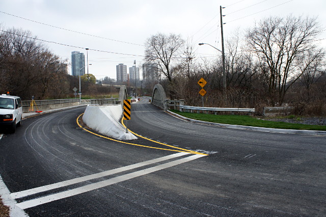
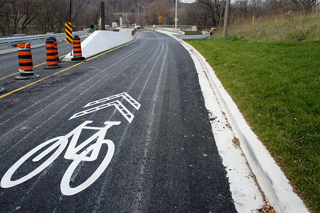
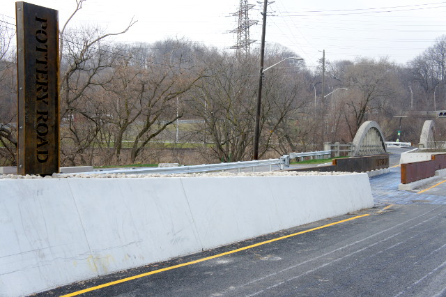
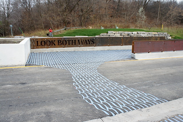
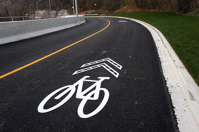
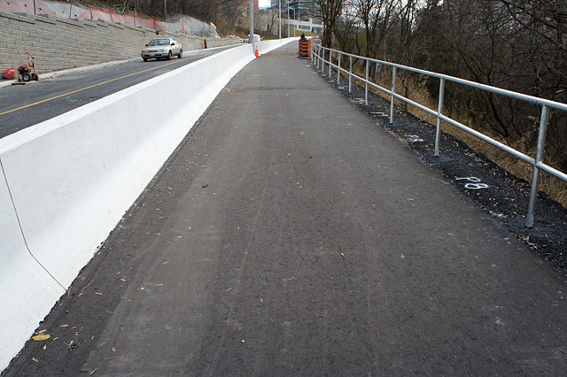
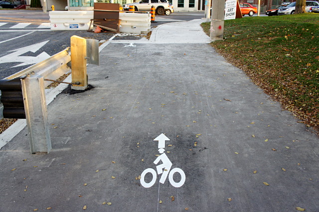
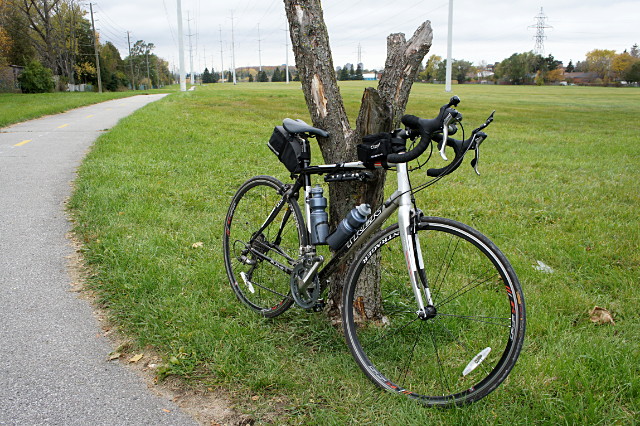
When Pottery Road re-opened at the end of November, cyclists and pedestrians rejoiced. So did drivers, but their joy was a little tempered. As a cyclist, I have nothing but praise (well, almost nothing but praise) for the outcome of the project, but I’ve heard a lot of complaints from drivers. Their concerns fall into two broad categories: why are these new traffic lanes so narrow, and what the hell are these bike symbols in the middle of the road? I first heard the former complaint from Risa, who drives down Pottery Road to work every day. I’ve since heard it from numerous others too. The latter complaint first came to the attention of Ward 29 Bikes via an email from a police officer who was recommending that the sharrows be removed because they confused motorists and encouraged cyclists to ride down the hill in the middle of the lane (which is kind of the whole point of them). He went on to explain that some motorists thought the sharrows indicated that they were driving in a bike lane. To get out of this supposed bike lane, they tried to do u-turns on the hill. I thought that was a joke when I first heard it, or at least an exaggeration to make some kind of anti-bike point. But after I heard the same thing elsewhere, I thought there might be a grain of truth in there after all.

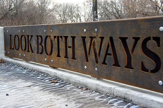
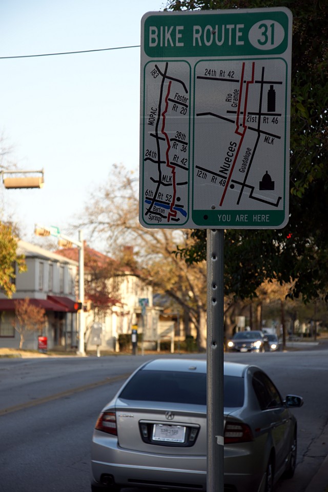
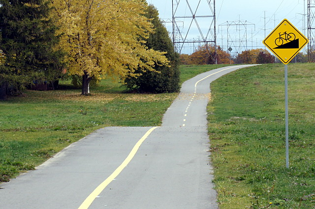
My first instinct is always to cast aside such tales as just part of the general grumpiness that accompanies any cycling infrastructure in this town. But after giving it some thought, I realized that drivers probably do have a legitimate problem with sharrows: they have no idea what a sharrow is. Although sharrows are explained over and over again on the city’s cycling website, in the city’s cycling newsletters, and at public meetings about cycling infrastructure, those audiences always consist of cyclists. I couldn’t recall sharrows ever being explained to drivers. Explanations aren’t included when you renew your licence, there are no explanatory signs beside the road, and no one holds public meetings explaining new cycling infrastructure to motorists. Whenever a new stop sign or traffic light appears, a big “NEW” sign is placed somewhere in the block leading up to it. Bike lanes, HOV lanes, bus lanes, turning lanes, crosswalks, and even parking spots all come with accompanying overhead or roadside signs. In contrast, sharrows just appear out of nowhere without any explanation. That may be fine on streets like Wellesley where they form short connectors near intersections between sections of the bike lanes, but there is no similar context on Pottery Road, where they appear mysteriously at the top of the hill and disappear just as enigmatically at the bottom of the hill.

When you’re inside the bubble of cycling information, it’s easy to forget that the memo was never really sent to the general public. Unless you are relatively active in the cycling community or visit www.toronto.ca/cycling once in a while, you probably have no idea what a sharrow is or what it’s supposed to indicate. What’s needed here is driver education, not removal of the sharrows. Fortunately, as reported on OpenFile last week, the city will be putting up signs in the spring explaining the shared lane markings.

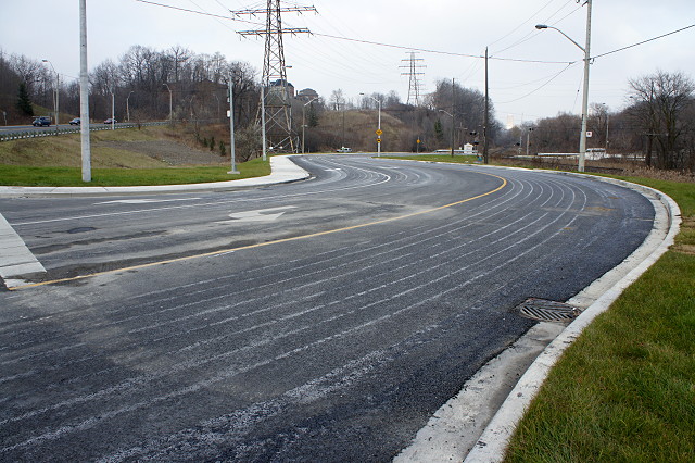
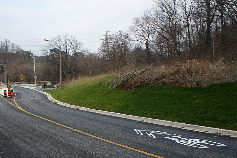
As for the narrow lanes, having driven up and down Pottery Road a few times myself, I agree that the lanes are narrower than they used to be. I could even be convinced to admit that I may feel a little crowded sharing the road with oncoming traffic between the retaining wall on one side and Jersey barrier on the other. And you know what? I don’t really have a problem with that. The lanes are still more than wide enough for cars and trucks to find their way up and down the hill. Studies say that narrowing lanes causes car drivers to slow down and I don’t have a problem with that, either. Speaking as a cyclist, pedestrian, and driver, anything that makes other drivers slow down a bit and think about driving safely is the kind of road improvement we need to see more often.

Pottery Road: Improvements for the future

[This is the last of three posts this week looking at the results of the Pottery Road reconstruction. Monday: the improvements for cyclists. Yesterday: the intersection with the Lower Don trail. Today: suggested improvements for the near future.]

In case it wasn’t obvious from my previous two posts about Pottery Road, I should say again that I quite like all of the improvements that the reconstruction project has brought to this important connector. Pottery Road is a historic oddity, one of a small handful of roads that lead directly to the floor of the Don Valley and provide connections to all of the parks, infrastructure, and attractions down there. The only other road access nearby is via Beechwood Drive, which also used to lead to a paper mill. Although car drivers can access alternative routes easily enough, the options for pedestrians and cyclists are too far away to be practical in many cases. So even though Pottery Road has been an absolutely miserable route for pedestrians and cyclists for as long as I can remember, we’ve continued to use it regularly.

So with all the good news covered in my previous posts, what’s the bad news? The main problem with the improvements is that they don’t go far enough. Literally. All of the improved cycling infrastructure and signage ends on the east side of the Don River, with no provision for cyclists between the Lower Don trail and Bayview Avenue. The new cycling facility gets cyclists as far as the trail, but leaves them on their own if they want to continue across the Don River to the Crothers’ Woods trailhead or to Bayview to ride down to the Brick Works or beyond.

Looking up Pottery Road from west of the Don River

There were two main constraints on taking the cycling infrastructure across the river as part of this project. The first is that there’s no room to add separate bike lanes across the bridges, and no money in the budget to continue the trail onto a dedicated pedestrian and cyclist bridge across the river. The second is that the cycling improvements on Pottery Road and at the Lower Don trail were a side-effect of the larger project; although cycling infrastructure was improved, it wasn’t the primary reason for the project. In fact, one city staffer told Ward 29 Bikes that they didn’t really consider Pottery Road to be a viable bike route and they’d rather cyclists use Beechwood Drive to get into the valley. Fortunately, cycling staff was able to get a lot accomplished against what seemed like a fair bit of push back. But despite that, I don’t see why, for example, the sharrows couldn’t have continued at least across the westbound bridge and been painted coming up from Bayview and across the eastbound bridge until a cyclist could get onto the separated path. This would have required a maximum of eight more sharrows to be painted on the road which, frankly, I can’t see as having any financial impact on a $5 million project.

To make matters worse, Bayview was the site of a parallel project that saw a new separated bike path extended and improved from Rosedale Valley Road past the Brickworks and up to Pottery Road. That path along Bayview ends here, at a sidewalk just a few feet short of Pottery Road:

Cycling trail ends abruptly

Duncan over at BikingToronto has a pretty good analysis/rant of the problem at this intersection, and I can’t say that I disagree with him. City staff has indicated to 29 Bikes a couple of times that they plan to connect this path to the Pottery Road path and the Lower Don trail, but the timeline has ranged from “maybe next year” to “it’s still in the conceptual stage.” In other words, I’m not holding my breath. But what makes the lack of connection particularly galling is that these two cycling projects, both undertaken at the same time, end less than 200 metres apart (only about 100 metres as the crow flies) and are separated by a wide, newly reconstructed road that could easily accommodate an extra stripe of paint along the sides and a couple of sharrows to safely direct cars and bikes across the bridges. I’m astonished that the two pieces of infrastructure were not connected.

Looking up Pottery Road from Bayview Avenue

My other concern is with the sharrows in the downbound lane as they reach the Lower Don trail. If you look at the pciture below, a cyclist riding at this point who wants to turn onto the trail has to make a quick 90-degree turn to the left to go southbound or right to go north. The problem here is that cyclists will have to slow down considerably to make the turn in either direction, and there’s a good chance that a speeding car or two will be right behind them.

Sharrows on Pottery Road

I know from experience riding down Pottery Road for many years that car drivers do not like to brake once they hit the bottom of the hill. Most are still travelling quite quickly as they approach the bridge here and I’m not sure how well they’ll react to a cyclist in the middle of the lane slowing down to 20 km/h to make a turn off the road. My sense is that most cyclists who are heading for the Don trail will just ride down the path on the side of the road. Only cyclists who are going straight through to the trailhead or Bayview will take the lane on the way down. Which is kind of ironic, considering that the infrastructure ignores their needs past this point.

As I said, I like what’s there, but it just doesn’t go far enough. I’m hoping that at the very least we can get sharrows across the bridges next year, and a dedicated cycling path linking up to Bayview shortly after. I understand that the current condition of the infrastructure here is temporary, but it could still stand to be fixed a bit to make it a little safer. It’s better than what was here before, but it could have been so much more without much additional effort.

The reconstruction fixes a lot of deficiencies, but many cyclists will continue to avoid Pottery Road for the simple inevitable reason that it’s a giant stinking hill that’s a real pain in the thighs to ride up on a bike. The final improvement I’d like to see, and one that I advocated at the Ward 29 Bikes public meeting two and a half years ago, is the addition of a bicycle elevator like the famous Trampe in Norway:

Pottery Road: Improvements at the Don trail

[This is the second of three posts this week looking at the results of the Pottery Road reconstruction. Yesterday: the improvements for cyclists. Today: the intersection with the Lower Don trail. Tomorrow: suggested improvements for the near future.]

Pottery Road is the only road crossing on the central and lower Don trails from Edwards Gardens at Lawrence and Leslie Avenues all the way down to Lake Shore Boulevard. That’s remarkable if you think about it. Along the way, cyclists share park roadways and paths with motorists and pedestrians as they duck under other streets that are carried over the Don Valley by numerous bridges, ride both under and over various rail lines, and cross the Don River and its tributaries a dozen or more times. As the only road crossing, Pottery Road is worthy of a bit more than the bollard or cattle gate that Toronto typically uses to separate roads from trails. City staff have done an outstanding job of designing the crossing with both safety and aesthetics in mind.

Pottery Road crossing with the Lower Don trail

One of the most obvious features is the large upright steel “Pottery Road” sign that guards one end of the pedestrian and cyclist refuge between the two road lanes. The refuge itself has been upgraded and improved significantly. In the old refuge, cyclists would have to look backwards to see oncoming traffic, which was neither convenient nor safe. The new alignment reverses the flow through the refuge so that cyclists are now looking straight ahead to see oncoming traffic. It’s a small change that you don’t even really think about until the first time that you ride through the new refuge. I don’t have measurements, but the new refuge seems roomier than the old, giving more space for passing cyclists and pedestrians.

Conspiciously missing from the paths that approach the refuge are any notices that cyclists must dismount. Given the lack of these signs on this and other recent projects, it looks like the city is finally taking cycling infrastructure design seriously instead of just assuming that everyone who is not in a car is always in the way of everyone who is in a car.

What we get instead of being told to get off our bikes are beautiful (to me, anyway) reminders made from cut steel plate and incorporated into the sides of the refuge:

Detail at the Pottery Road crossing of the Lower Don trail

Detail at the Pottery Road crossing of the Lower Don trail

This level of design is far above the typical Toronto Jersey barrier, which is so drearily common that it could go on our municipal flag. I thought it was curious that the rusty steel design here recalls neither the historic concrete bowstring bridge a few steps away nor the nearby Don Valley Brick Works and Todmorden Mills, but it works anyway and is suitably industrial to reflect the heritage of the sites.

The refuge and road crossing also get another significant improvement, in textured and coloured asphalt to mark the intersection. The blue river-like ripples start on the trail, cross the road into the refuge, and flow out the other side:

Detail at the Pottery Road crossing of the Lower Don trail

Detail at the Pottery Road crossing of the Lower Don trail

Detail at the Pottery Road crossing of the Lower Don trail

The pattern has been cut or laid directly into the asphalt and the colour looks like it’ll last. I’ll keep an eye on it for any fading.

Also seen above is the rebuilt pathway north of Pottery Road. This had been a wide 2-lane road that connected Pottery Road to Beechwood Drive (I even remember my family driving on it once in my youth). In recent years, it was almost always gated closed and used only by trucks dumping loads at the snow dump beside the Don River, park vehicles, cyclists, and pedestrians. That snow dump was finally closed two years ago and is now called Cottonwood Flats (PDF). Since there’s no longer any need for heavy equipment to use the road, it’s been converted into a normal park pathway.

As I mentioned yesterday, there’s now a direct link from the Lower Don trail to the path up the side of Pottery Road:

The turnoff to the Lower Don trail

And as I mentioned the other day, all of the work comes with improved wayfinding signs:

Improved wayfinding signs on the Lower Don trail

If you ask me, the improvements on the Lower Don trail at Pottery Road alone are worth the inconvenience of closing the road for six months. The work here shows a real understanding of cycling safety and an acknowledgement that the Lower Don trail is an important piece of infrastructure.

Pottery Road: New and improved for bikes

Sharrows on Pottery Road

[This is the first of three posts this week looking at the results of the Pottery Road reconstruction. Today: the improvements for cyclists. Tomorrow: the intersection with the Lower Don trail. Wednesday: suggested improvements for the near future.]

Drivers are looking forward to Pottery Road re-opening this week after a long and troubled reconstruction. The new road brings improvements for pedestrians and cyclists too, but we’ve been enjoying them for months already. Although the road has remained closed to vehicular traffic between Todmorden Mills and Broadview Avenue since May, pedestrians and cyclists have been able to navigate Pottery Road from top to bottom throughout the project and the main pathway has been all but complete since early September.

Sharrows on Pottery Road

The most immediately visible (and likely to be controversial) improvement is the line of sharrows in the middle of the downhill/westbound lane (top and above). They’re meant to indicate that cyclists heading west should take the middle of the lane all the way down the hill past the DVP and that car drivers should wait behind them. Why is this going to be controversial? Because many car drivers will hate and/or not understand having to drive behind bikes, and many cyclists will simply refuse to ride down the middle of the lane with cars behind them. A confident cyclist can travel at least 50-60 km/h down Pottery Road and should have no trouble taking the lane. But I think that this sharrowed lane will see a small minority of Don Valley-bound cyclists, with most instead opting for the path at the side of the road.

Wide path beside Pottery Road

The path has been widened considerably and is the preferred option for all cyclists heading up the hill. The widening was accomplished largely by claiming space that had been used for a shoulder, moving the concrete barrier closer to the traffic lane. Before May, cyclists had a bleak choice to make when it came to going uphill: join traffic on the left side of the barrier, which required taking the lane in two places (not easy for most cyclists when plodding up a hill like Pottery Road) or take the pathway, knowing that it was in terrible condition and too narrow to comfortably pass a pedestrian or cyclist heading in the other direction. The new path is in excellent condition and is consistently wide enough for both cyclists and pedestrians travelling in both directions. My only hope is that cyclists who want to bomb down the hill will stick to the traffic lane rather than taking the path.

Walking/cycling path ducks under the DVP

The path used to disappear where the road goes under the DVP, passable only by determined pedestrians. Cyclists were forced to take the road. The reconstruction has opened up this part of the path with a retaining wall giving lots of room for comfortable passage and allowing cyclists a direct connection to and from the Lower Don trail.

The turnoff to the Lower Don trail

This is the new connection from the pathway to the Lower Don trail heading south, which in turn connects up with the Martin Goodman trail at Lake Shore Boulevard. I’ll have a closer look at this intersection in the next post.

A mini arrow pointing the way for cyclists approaching Broadview

At the top of the hill at Broadview, small arrows painted on the pathway direct cyclists over to the left, where a curb cut takes them into Toronto’s shortest bike lane, running about 3 metres from the curb to the crosswalk. It’s a nice touch that takes cyclists back onto the road with minimal effort while reducing conflict with both pedestrians and motorists.

As far as they go, the reconstruction provides a big step forward for cyclists trying to access the Don Valley via Pottery Road. As someone who rides up and down this street regularly, I’ve already come to appreciate many of the changes, especially the added width of the path and the connection to the Lower Don trail. I’ll address the Lower Don connection and some of the places where the infrastructure could be improved  in the next two posts in this series.

When is it acceptable to delay someone's commute?

I always marvel at how it’s okay for non-car commuters to suffer “minimal impact” to their travel times, but if a car commuter suffers the same “minimal impact,” everyone screams like it’s the end of the world.

I believe that the language people use says a lot about their beliefs and intentions, so I find it interesting that someone like Rob Ford, in the two quotes linked above, basically sits on opposite sides of the congestion fence at the same time. In defending TTC cuts (or as he calls them, “service level modifications”), he co-opts the reasoning of cycling advocates who defend bike lanes, saying that a few extra seconds of waiting isn’t a big deal. But in his case, he’s applying it to transit riders instead of drivers. It’s a perfect example of windshield perspective: delaying my commute by a few seconds is a travesty; but it’s okay if it happens to those other people. All those buses and bikes just get in my way anyway.

My guess is that Ford will always rail against congestion while simultaneously taking actions that will only make it worse, all in the vain pursuit of saving a few seconds and/or dollars. The only question is how long this council will let him get away with it.

Inching closer to wayfinding perfection

The new wayfinding signs on the Don Valley trail

I spend a lot of time looking at wayfinding signs. It’s not because I don’t know my way around, but because a lot of other people don’t. If I had a nickel for every time that I tried to explain to some lost soul on the Don Valley trails how to get to a particular destination or back out onto the street, I’d have at least $2.65. Unless you already know your way around Toronto’s ravine trails, you’re almost certainly going to get lost at least once the first time you try to get somewhere new.

Just a couple of weeks ago I mentioned that the wayfinding signs on the new Gatineau hydro corridor trail were much improved over previous versions elsewhere in the city, but could still benefit from maps to display connections to other trails and attractions. Well, it looks like the city is continuing its incremental improvement of cycling wayfinding signs by incorporating the improvements seen on the Gatineau trail and finally adding a map onto each sign. The first one of these I’ve seen is on the Lower Don trail at the newly reconstructed intersection with Pottery Road (more about that next week). Here’s a closeup of the info on the new sign:

Closeup of the new wayfinding signs on the Don Valley trail

Name of road at current intersection? Check.

Distance to next exit? Check.

Map showing current location? Check.

Map showing connections to other trails? Check.

Map showing nearby destinations? Sorta-check.

Although the map lists upcoming parks, shows route options, and names streets at egress points, it still doesn’t really show any attractions along the way. It does point the way to Todmorden Mills, which is just around the corner from this sign, but doesn’t show the Crothers’ Woods trails just on the other side of the river, the Brick Works a quick ride away down Bayview, or—most importantly—the Dairy Queen at the top of Pottery Road. The map could also orient cyclists in the larger street grid by showing the closest main streets, not just ones that cross the path. Also, the map curiously omits the access point at Don Mills Road that goes up to Flemingdon Park, even though it does show the access road into nearby Thorncliffe. The omission may be because the Don Mills access is more informal and you have to climb a very short staircase to get to it.

Still, despite this niggling on my part, these signs show that the city of Toronto has made huge improvements to its wayfinding signs in just a couple of years. Gone are the days when the city seemed to assume that everyone carried a cycling map at all times to find their way around the mostly unsigned paths throughout the city. I liked the improvements on the hydro corridor signs (where present), and appreciate this additional step forward as well. It compares well to the cycling signs I saw in Austin, Texas last year:

Wayfinding sign in Austin, Texas

The Toronto signs are less cluttered and present the information more clearly, but I think they could use a bit more detail. I look forward to seeing more of them along the trails.

Advertising good, bikes bad

Info Post in front of Carrot Common

Enough has been written about these stupid info pillars elsewhere that I won’t bore you with another diatribe against their design or the questionable process that resulted in the city being saddled with them in the first place. This one is in front of Carrot Common on Danforth and in addition to looking ugly, replaced a perfectly good post and ring bike rack, as seen by Google Street View: Google Street View showing removed post and ring

I’ve written to my councillor to ask why parking for two bikes was removed so that Astral could place two giant ads on the sidewalk. It’s almost impossible to find bike parking in this area during the summer and only marginally easier during the spring and fall. We need many more racks here, not fewer. I don’t think that drivers or merchants would quietly stand by if they lost two car parking spots to a billboard, and I don’t see why cyclists should be expected to do so either.

Random notes for pedestrians

[Continuing a series I started last year with motorists and other cyclists.]

Please look up before you cross the street. We’re both lucky that I tuned up my brakes last night.

If you’re at the crosswalk and I’m stopped, waiting for you to cross, please don’t pause and try to wave me through; you have the right of way and I’m waiting here until you get across.

There are leash laws in this city, and one of the things they’re designed to prevent is your dog chasing my bike. The world isn’t your dog run and that leash isn’t doing anyone any good dangling around your neck.

This is a bike lane. It’s not a jogging lane, a standing-and-talking lane, a wait-for-cars-before-crossing-the-road lane, or a peer-down-the-street-looking-for-a-bus lane.

If you’re going to step into the bike lane to get around a knot of other pedestrians, at least have the good sense to check for oncoming bikes first.

If you’re walking four abreast on the park path, do the polite thing and move aside for others.

One ding of the bell is a polite notice. Two dings is a request. Three dings is an attempt to be heard through your earbuds. Four dings is exasperation.

Please train your children and dogs not to run at bikes.

Contrary to popular belief, bikes cannot stop on a dime. Not even on a loonie.

Hey kids, you know when I’m coming down the road and you stand aside with your hockey sticks and shout, “Biiiiike….”? I love it.

Just because the lane of cars is stopped doesn’t mean that it’s safe to step into the bike lane.

There’s a perfectly good sidewalk right beside you; why do you have to push your SUV stroller in the wrong direction in the bike lane? And seriously, you’re giving me a dirty look for not giving you a wide enough berth? Get over yourself.

I’m all for kids playing in the street, but playing in the intersection is asking for trouble.

Actually, this is a contra-flow bike lane, I am allowed to ride in this direction on this one-way street, and you should look both ways before stepping onto the road.

When my bike is parked at the local post-and-ring, it is not a footrest, luggage rack, purse stand, personal mirror, cell phone booth, or smoking area.

I’m happy to answer any questions you have about my bike, lock, panniers, trailer, jacket, helmet cover, lights, basket, or anything else you find interesting about my gear, but opening with, “How much did that cost?” is pretty rude.

Thank you for stopping and asking if I was okay after you saw me fall over sideways after stopping at the red light. I also thank you for nodding politely when I muttered something about clipless pedals and for stifling your laughter until I was out of earshot.

A more direct message for drivers

Man, 58, killed here by traffic

I’m sure you’ve heard about the collision with a truck that killed cyclist Jenna Morrison on Monday. There will be a memorial ride on Monday and a ghost bike will be placed at the intersection where she was killed. A ghost bike both memorializes the cyclist and serves as a reminder to all of what was almost certainly a needless tragedy. There’s already a different kind of memorial at the site of the collision.

Beyond ghost bikes and guerrilla bike lane painting,  I think that a less subtle message to drivers is needed wherever a cyclist or pedestrian (or, indeed, a car driver or passenger) is needlessly killed. A ghost bike can be moving if you know what it means, but how many drivers really understand or respect the message? Few, I’d guess. And the ones who do get the message aren’t the ones who need to get it. Which brings me to the photo at the top of this post:

8-28-00 Man 58 Killed here by traffic.

Stencilled with the outline of a body on the street corner where, well, a 58-year-old man was killed by traffic on August 28, 2000. How’s that for direct? When I saw this stencil in San Francisco in September, 2000, you can bet that I paid attention. That I took a picture and knew exactly where to find it in my film archives more than 11 years later should speak to the effectiveness of the blunt message.

The story behind these stencils is told in Jeff Ferrell’s Tearing Down the Streets: Adventures in Urban Anarchy:

Outraged about the way in which “automobiles seem to have taken over the streets and society,” [Ken] Kelton travels the streets of San Francisco, map in hand, searching for sites at which pedestrians have been killed by automobiles. Once a site is located, Kelton lays a life-sized body stencil on the pavement, outlines it with white spraypaint, and writes an asphalt epitaph: “5-15-99 Nameless Man Killed Here By Traffic”; “4-15-99 Woman 71 Killed Here by Traffic.” Though police officials confirm that Kelton risks citation for public vandalism, he continues to consecrate city streets because, as he says, “there’s something wrong with the whole traffic layout, the whole system.”

[…]

A pedestrian death “doesn’t seem to matter. It doesn’t even make the paper,” he says. “I’m trying to underscore that this is life and death.”

Here’s a picture of Kelton with his stencil. Although his crusade was specifically about pedestrian deaths, that article says that he was inspired by a similar activist in New York who memorialized cyclists who were killed in traffic.

The contrast between a ghost bike and a “killed here by traffic” stencil is notable: a ghost bike abstractly represents mourning, while Kelton’s stencil is a more direct declaration that enough is enough. At some point, cyclists, drivers, pedestrians, and—most importantly—our elected leaders have to stop accepting the status quo and say “enough is enough.” That would require taking the safety needs of all road users seriously.

Would having stencils like this dotting city streets cause drivers to be more careful? Maybe not. But it would at least make everyone a little more aware of the human cost of our modern transportation system instead of merely sweeping the statistics under the “it was just an accident” carpet.

Now close your eyes and imagine passing five of these on your way to work every day, whatever mode of transportation you choose. Would it change anything that you do?

Gatineau hydro corridor

Gatineau Hydro Corridor

I’ve really been looking forward to the completion of the trail through the Gatineau hydro corridor that bisects Scarborough. It was supposed to be finished in March of this year, and then in September, but work is still ongoing. All of the paving is done, but traffic signals, benches, and other finishing touches are still going in. I didn’t want to wait until the spring to ride it, so I took a couple of rides last week to check it out.

Overall, I’d say that the path is a huge improvement for cyclists who want a through-route across most of Scarborough. There are still some rough spots along the way and gaps in the route, particularly between Ellesmere Road and the 401, but riding the disjointed route is still preferable to my old routes to get to the northeastern corner of Scarborough and beyond, which involved long stretches of misery fighting with traffic along McCowan, Warden, Sheppard, Steeles, or any of the other arterials where there’s little choice but to put your head down, grit your teeth, and pedal as fast as possible.

The Gatineau corridor trail is comprised of several new or upgraded sections of path that join a smattering of Metro-era paths into a nearly continuous off-road route from Victoria Park Avenue just north of Eglinton Avenue clear across Scarborough to Meadowvale Road north of Sheppard.

Steep hill

The route tends to meander a bit and goes on-road in two places, sometimes quite a distance away from the hydro corridor before joining up again. The wayfinding is adequate and always shows the next street or two, but doesn’t include major destinations, area maps, or links to other trails. Sometimes you get dumped at a crossing with conflicting signage or no signage at all.

The city’s original project presentations [PDF] for this route recommended an on-street connection along Ellesmere from where the trail currently ends at the western end of Miliary Trail to Conlins Road, where you pick up the trail again after crossing the 401. Instead, I would recommend turning left up Military Trail at Ellesmere, and following Military Trail to…Ellesmere. It adds about a kilometre to the trip, but it saves a truly miserable ride along Ellesmere. In addition to high-speed traffic and relatively narrow lanes, the map doesn’t show that on Ellesmere, you have to climb two big hills out of the Highland Creek valley. If you follow Military Trail instead, you avoid the second valley and only have to deal with one climb. There’s also less traffic and a fake bike lane along a significant portion of the road.

Bike and pedestrian signals have been added to all major road crossings, though not all of them have been activated yet. Even when the trail coincides with a major intersection (as at Lawrence and Brimley), cyclists are given their own crossing signals and path adjacent to the pedestrian crossover. At minor streets, cyclists generally face a yield sign and, remarkably for Toronto, are not told to dismount to cross. There are a couple of exceptions, but they both seem to be leftovers from the Metro era trails.

For future work, I’d really like to see the two most significant gaps filled in: from Military Trail to Conlins, and from Victoria Park to the Don Valley. Add infrastructure to those two sections and you’ve got a near-continuous off-road path from downtown to the farthest reaches of Scarborough.

On its way to the Ontario-Quebec boundary, this corridor passes just a few kilometres away from my cottage. So, when can I get the rest of it paved?

The gallery below has a partial tour and some specific commentary about aspects of the trail that I like or that could be improved. Traffic lights and paint will be in place eventually, so I’m not terribly worried about that. I’m looking forward to escaping the city more often via this path.

Read More …