Inching closer to wayfinding perfection

The new wayfinding signs on the Don Valley trail

I spend a lot of time looking at wayfinding signs. It’s not because I don’t know my way around, but because a lot of other people don’t. If I had a nickel for every time that I tried to explain to some lost soul on the Don Valley trails how to get to a particular destination or back out onto the street, I’d have at least $2.65. Unless you already know your way around Toronto’s ravine trails, you’re almost certainly going to get lost at least once the first time you try to get somewhere new.

Just a couple of weeks ago I mentioned that the wayfinding signs on the new Gatineau hydro corridor trail were much improved over previous versions elsewhere in the city, but could still benefit from maps to display connections to other trails and attractions. Well, it looks like the city is continuing its incremental improvement of cycling wayfinding signs by incorporating the improvements seen on the Gatineau trail and finally adding a map onto each sign. The first one of these I’ve seen is on the Lower Don trail at the newly reconstructed intersection with Pottery Road (more about that next week). Here’s a closeup of the info on the new sign:

Closeup of the new wayfinding signs on the Don Valley trail

Name of road at current intersection? Check.

Distance to next exit? Check.

Map showing current location? Check.

Map showing connections to other trails? Check.

Map showing nearby destinations? Sorta-check.

Although the map lists upcoming parks, shows route options, and names streets at egress points, it still doesn’t really show any attractions along the way. It does point the way to Todmorden Mills, which is just around the corner from this sign, but doesn’t show the Crothers’ Woods trails just on the other side of the river, the Brick Works a quick ride away down Bayview, or—most importantly—the Dairy Queen at the top of Pottery Road. The map could also orient cyclists in the larger street grid by showing the closest main streets, not just ones that cross the path. Also, the map curiously omits the access point at Don Mills Road that goes up to Flemingdon Park, even though it does show the access road into nearby Thorncliffe. The omission may be because the Don Mills access is more informal and you have to climb a very short staircase to get to it.

Still, despite this niggling on my part, these signs show that the city of Toronto has made huge improvements to its wayfinding signs in just a couple of years. Gone are the days when the city seemed to assume that everyone carried a cycling map at all times to find their way around the mostly unsigned paths throughout the city. I liked the improvements on the hydro corridor signs (where present), and appreciate this additional step forward as well. It compares well to the cycling signs I saw in Austin, Texas last year:

Wayfinding sign in Austin, Texas

The Toronto signs are less cluttered and present the information more clearly, but I think they could use a bit more detail. I look forward to seeing more of them along the trails.

Advertising good, bikes bad

Info Post in front of Carrot Common

Enough has been written about these stupid info pillars elsewhere that I won’t bore you with another diatribe against their design or the questionable process that resulted in the city being saddled with them in the first place. This one is in front of Carrot Common on Danforth and in addition to looking ugly, replaced a perfectly good post and ring bike rack, as seen by Google Street View: Google Street View showing removed post and ring

I’ve written to my councillor to ask why parking for two bikes was removed so that Astral could place two giant ads on the sidewalk. It’s almost impossible to find bike parking in this area during the summer and only marginally easier during the spring and fall. We need many more racks here, not fewer. I don’t think that drivers or merchants would quietly stand by if they lost two car parking spots to a billboard, and I don’t see why cyclists should be expected to do so either.

Random notes for pedestrians

[Continuing a series I started last year with motorists and other cyclists.]

Please look up before you cross the street. We’re both lucky that I tuned up my brakes last night.

If you’re at the crosswalk and I’m stopped, waiting for you to cross, please don’t pause and try to wave me through; you have the right of way and I’m waiting here until you get across.

There are leash laws in this city, and one of the things they’re designed to prevent is your dog chasing my bike. The world isn’t your dog run and that leash isn’t doing anyone any good dangling around your neck.

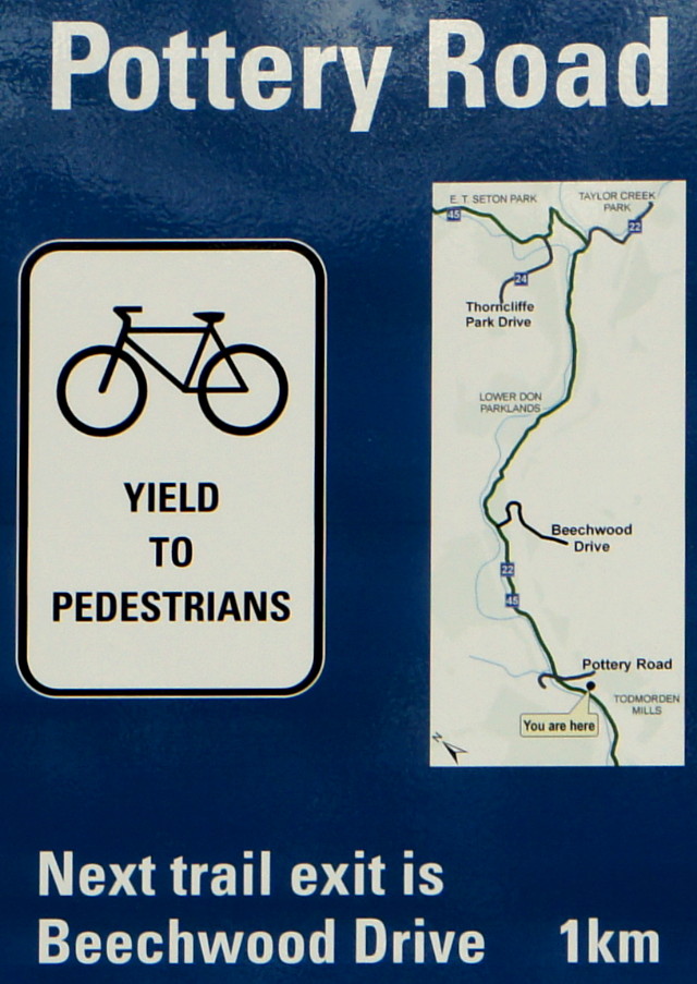
This is a bike lane. It’s not a jogging lane, a standing-and-talking lane, a wait-for-cars-before-crossing-the-road lane, or a peer-down-the-street-looking-for-a-bus lane.

If you’re going to step into the bike lane to get around a knot of other pedestrians, at least have the good sense to check for oncoming bikes first.

If you’re walking four abreast on the park path, do the polite thing and move aside for others.

One ding of the bell is a polite notice. Two dings is a request. Three dings is an attempt to be heard through your earbuds. Four dings is exasperation.

Please train your children and dogs not to run at bikes.

Contrary to popular belief, bikes cannot stop on a dime. Not even on a loonie.

Hey kids, you know when I’m coming down the road and you stand aside with your hockey sticks and shout, “Biiiiike….”? I love it.

Just because the lane of cars is stopped doesn’t mean that it’s safe to step into the bike lane.

There’s a perfectly good sidewalk right beside you; why do you have to push your SUV stroller in the wrong direction in the bike lane? And seriously, you’re giving me a dirty look for not giving you a wide enough berth? Get over yourself.

I’m all for kids playing in the street, but playing in the intersection is asking for trouble.

Actually, this is a contra-flow bike lane, I am allowed to ride in this direction on this one-way street, and you should look both ways before stepping onto the road.

When my bike is parked at the local post-and-ring, it is not a footrest, luggage rack, purse stand, personal mirror, cell phone booth, or smoking area.

I’m happy to answer any questions you have about my bike, lock, panniers, trailer, jacket, helmet cover, lights, basket, or anything else you find interesting about my gear, but opening with, “How much did that cost?” is pretty rude.

Thank you for stopping and asking if I was okay after you saw me fall over sideways after stopping at the red light. I also thank you for nodding politely when I muttered something about clipless pedals and for stifling your laughter until I was out of earshot.

Use your nodle

Chicken nodle soup

Call me what you will, but I don’t think that expecting properly spelled food labels in the local Sobeys is asking for too much.  Everybody makes mistakes (guilty!), but is it really possible that no employees or managers noticed this label all day long yesterday? Or is it more likely that the staff noticed but just didn’t care enough to fix it? Either way, it doesn’t exactly give me confidence that Sobeys treats my food with any greater care than, say, the local Loblaws.

The problem with modern design and ambiguous instructions

Much of modern design is sleek and minimalist. Unfortunately, some items are designed to be so sleek that their actual function isn’t always readily discernible. Such was the case with the office mailbox below, located directly across from the building elevator. After receiving one too many gum wrappers and coffee cups in the mail, someone taped up a notice describing the purpose of the sleek little box:

This is a mailbox not a garbage can

MAILBOX
*Please do not dispose of garbage here*

I frequently say that if a simple everyday object like a mailbox or garbage can requires instructions or explanations, it’s a failed design. Even well-meaning instructions can cause confusion. But all seemed well and good until another note appeared a month later, clarifying what the original note meant by “mailbox”:

This mailbox is for receiving, not sending

And later that day, the grateful sender retrieved the wayward piece of mail and left a thank-you note:

Thanks for not throwing out my letter

Only in Toronto.

A more direct message for drivers

Man, 58, killed here by traffic

I’m sure you’ve heard about the collision with a truck that killed cyclist Jenna Morrison on Monday. There will be a memorial ride on Monday and a ghost bike will be placed at the intersection where she was killed. A ghost bike both memorializes the cyclist and serves as a reminder to all of what was almost certainly a needless tragedy. There’s already a different kind of memorial at the site of the collision.

Beyond ghost bikes and guerrilla bike lane painting,  I think that a less subtle message to drivers is needed wherever a cyclist or pedestrian (or, indeed, a car driver or passenger) is needlessly killed. A ghost bike can be moving if you know what it means, but how many drivers really understand or respect the message? Few, I’d guess. And the ones who do get the message aren’t the ones who need to get it. Which brings me to the photo at the top of this post:

8-28-00 Man 58 Killed here by traffic.

Stencilled with the outline of a body on the street corner where, well, a 58-year-old man was killed by traffic on August 28, 2000. How’s that for direct? When I saw this stencil in San Francisco in September, 2000, you can bet that I paid attention. That I took a picture and knew exactly where to find it in my film archives more than 11 years later should speak to the effectiveness of the blunt message.

The story behind these stencils is told in Jeff Ferrell’s Tearing Down the Streets: Adventures in Urban Anarchy:

Outraged about the way in which “automobiles seem to have taken over the streets and society,” [Ken] Kelton travels the streets of San Francisco, map in hand, searching for sites at which pedestrians have been killed by automobiles. Once a site is located, Kelton lays a life-sized body stencil on the pavement, outlines it with white spraypaint, and writes an asphalt epitaph: “5-15-99 Nameless Man Killed Here By Traffic”; “4-15-99 Woman 71 Killed Here by Traffic.” Though police officials confirm that Kelton risks citation for public vandalism, he continues to consecrate city streets because, as he says, “there’s something wrong with the whole traffic layout, the whole system.”

[…]

A pedestrian death “doesn’t seem to matter. It doesn’t even make the paper,” he says. “I’m trying to underscore that this is life and death.”

Here’s a picture of Kelton with his stencil. Although his crusade was specifically about pedestrian deaths, that article says that he was inspired by a similar activist in New York who memorialized cyclists who were killed in traffic.

The contrast between a ghost bike and a “killed here by traffic” stencil is notable: a ghost bike abstractly represents mourning, while Kelton’s stencil is a more direct declaration that enough is enough. At some point, cyclists, drivers, pedestrians, and—most importantly—our elected leaders have to stop accepting the status quo and say “enough is enough.” That would require taking the safety needs of all road users seriously.

Would having stencils like this dotting city streets cause drivers to be more careful? Maybe not. But it would at least make everyone a little more aware of the human cost of our modern transportation system instead of merely sweeping the statistics under the “it was just an accident” carpet.

Now close your eyes and imagine passing five of these on your way to work every day, whatever mode of transportation you choose. Would it change anything that you do?

A Toronto Moose even farther afield

Speaking of the Toronto Moose, I’m reminded of my experience with Bay Street Moose a few years ago. He originally stood in the concrete meadow at the corner of King and Bay, where I passed him every day on the streetcar for six months. Of all the moose I saw on my daily travels, he was both the most familiar and my favourite. When he was finally carted away in the autumn of 2000, I figured I’d never see him again. Fast forward to July 2001: I was in the Netherlands on a business trip and had the weekend to do some quick exploring. I took the train to The Hague and decided to stroll through the city in the general direction of the Binnenhof and Queen Bea’s office. I ventured down a tree-lined path between two streets and discovered an outdoor exhibition of various sculptures from around the world. The sculptures ranged from interesting to weird, and my mouth dropped to the ground when I spotted my old friend standing proudly among them:

Bay Street Moose in The Hague, 2001

It was jarring to see a piece of my daily Toronto life on display 6,000 km away, where I happened to find it because I wanted a bit of shade on a sunny day. I gave him a pat, took a couple of pictures, and shook my head all the way home.

A Toronto Moose ventures far afield

Toronto Moose at Primitive Designs

Last seen in their native habitat in Y2K, the Toronto Moose continue to pop up in all kinds of unexpected places. This one guards the tiki huts, (fake) palm trees, and teak carvings of…Port Hope? Standing guard at the entrance to Primitive Designs in Port Hope, this moose migrated here by way of Pickering, where it resided for a number of years before being bought earlier this year by Primitive Designs owner Ron Dacey. Unfortunately, I can’t tell which moose this was; I can’t find a matching mug shot in the City of Toronto’s mooseum gallery. Either it’s one of the missing portraits or (more likely) it’s been repainted since leaving the big city.

Ron wasn’t around when I popped by for a visit this week, but staff were split 2-1 on whether the moose was even for sale, never mind the asking price. Majority opinion was that Ron likes it too much to sell it just yet. But everything has a price, especially in retail.

Related: A number of Toronto Moose still dot the city. I’ve written about two of them.

Gatineau hydro corridor

Gatineau Hydro Corridor

I’ve really been looking forward to the completion of the trail through the Gatineau hydro corridor that bisects Scarborough. It was supposed to be finished in March of this year, and then in September, but work is still ongoing. All of the paving is done, but traffic signals, benches, and other finishing touches are still going in. I didn’t want to wait until the spring to ride it, so I took a couple of rides last week to check it out.

Overall, I’d say that the path is a huge improvement for cyclists who want a through-route across most of Scarborough. There are still some rough spots along the way and gaps in the route, particularly between Ellesmere Road and the 401, but riding the disjointed route is still preferable to my old routes to get to the northeastern corner of Scarborough and beyond, which involved long stretches of misery fighting with traffic along McCowan, Warden, Sheppard, Steeles, or any of the other arterials where there’s little choice but to put your head down, grit your teeth, and pedal as fast as possible.

The Gatineau corridor trail is comprised of several new or upgraded sections of path that join a smattering of Metro-era paths into a nearly continuous off-road route from Victoria Park Avenue just north of Eglinton Avenue clear across Scarborough to Meadowvale Road north of Sheppard.

Steep hill

The route tends to meander a bit and goes on-road in two places, sometimes quite a distance away from the hydro corridor before joining up again. The wayfinding is adequate and always shows the next street or two, but doesn’t include major destinations, area maps, or links to other trails. Sometimes you get dumped at a crossing with conflicting signage or no signage at all.

The city’s original project presentations [PDF] for this route recommended an on-street connection along Ellesmere from where the trail currently ends at the western end of Miliary Trail to Conlins Road, where you pick up the trail again after crossing the 401. Instead, I would recommend turning left up Military Trail at Ellesmere, and following Military Trail to…Ellesmere. It adds about a kilometre to the trip, but it saves a truly miserable ride along Ellesmere. In addition to high-speed traffic and relatively narrow lanes, the map doesn’t show that on Ellesmere, you have to climb two big hills out of the Highland Creek valley. If you follow Military Trail instead, you avoid the second valley and only have to deal with one climb. There’s also less traffic and a fake bike lane along a significant portion of the road.

Bike and pedestrian signals have been added to all major road crossings, though not all of them have been activated yet. Even when the trail coincides with a major intersection (as at Lawrence and Brimley), cyclists are given their own crossing signals and path adjacent to the pedestrian crossover. At minor streets, cyclists generally face a yield sign and, remarkably for Toronto, are not told to dismount to cross. There are a couple of exceptions, but they both seem to be leftovers from the Metro era trails.

For future work, I’d really like to see the two most significant gaps filled in: from Military Trail to Conlins, and from Victoria Park to the Don Valley. Add infrastructure to those two sections and you’ve got a near-continuous off-road path from downtown to the farthest reaches of Scarborough.

On its way to the Ontario-Quebec boundary, this corridor passes just a few kilometres away from my cottage. So, when can I get the rest of it paved?

The gallery below has a partial tour and some specific commentary about aspects of the trail that I like or that could be improved. Traffic lights and paint will be in place eventually, so I’m not terribly worried about that. I’m looking forward to escaping the city more often via this path.

Read More …

This is your turd and final warning (part 2)

How to go potty

You know I love signs. Many of the best ones express one person’s frustration at something that’s beyond his or her control. More often than you’d think, this relates to another person’s (or dog’s) bodily functions. I get such perverse pleasure when I walk into a new (to me) public washroom and see a sign like this. I can’t help but wonder how long and often the sign-writer has had to put up with the problem before going back to his desk, selecting a 44-point font in Word, printing out a shaming notice, and taping it up outside the stalls. But I’m even more curious about whether shaming notices actually work. Anecdotal evidence would say that they don’t, but I can’t tell you how many times I’ve wanted to track down the person who made one of these signs and ask if it generated a concrete result beyond the short-term satisfaction of calling someone out for anti-social behaviour.